

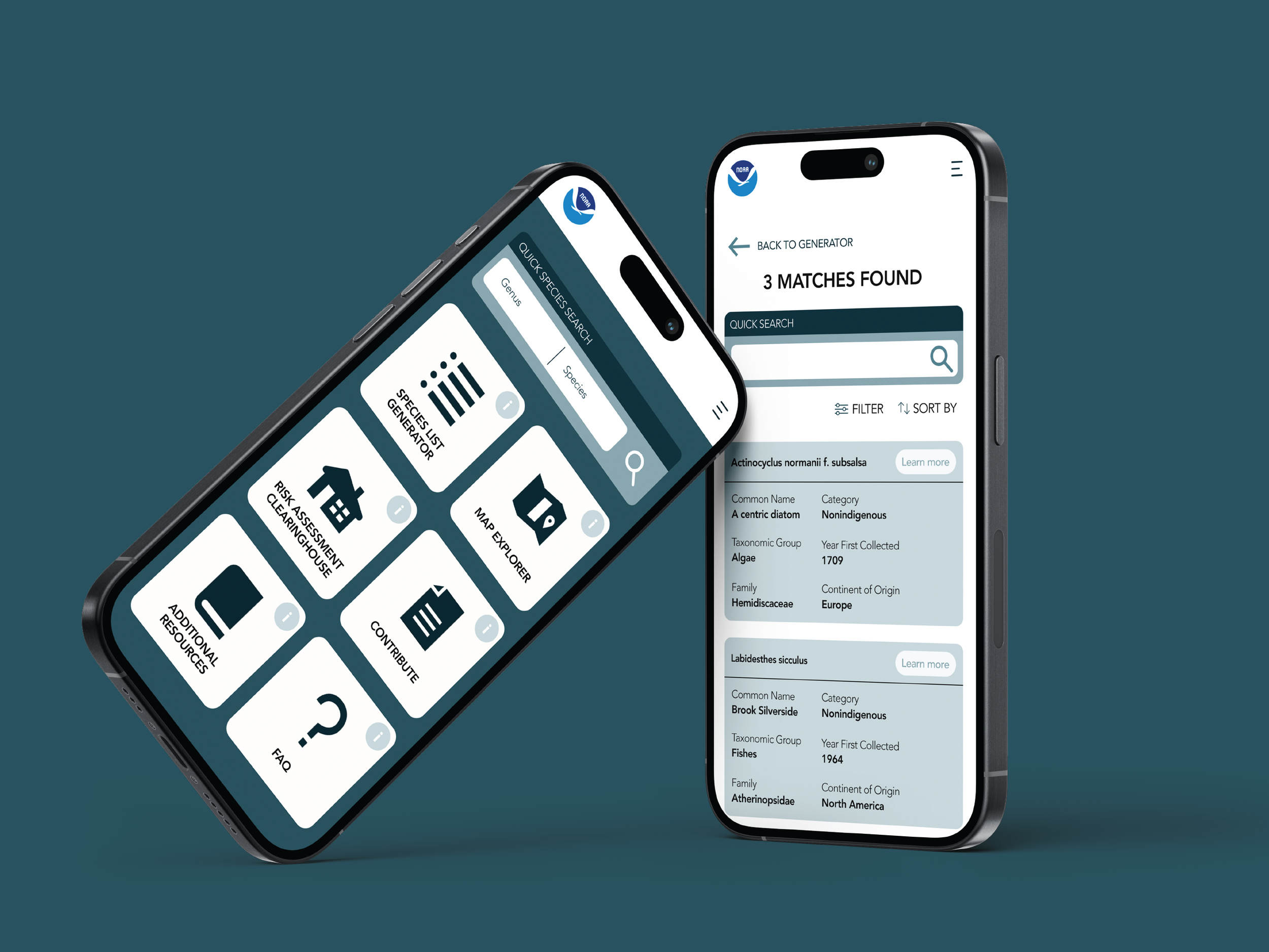
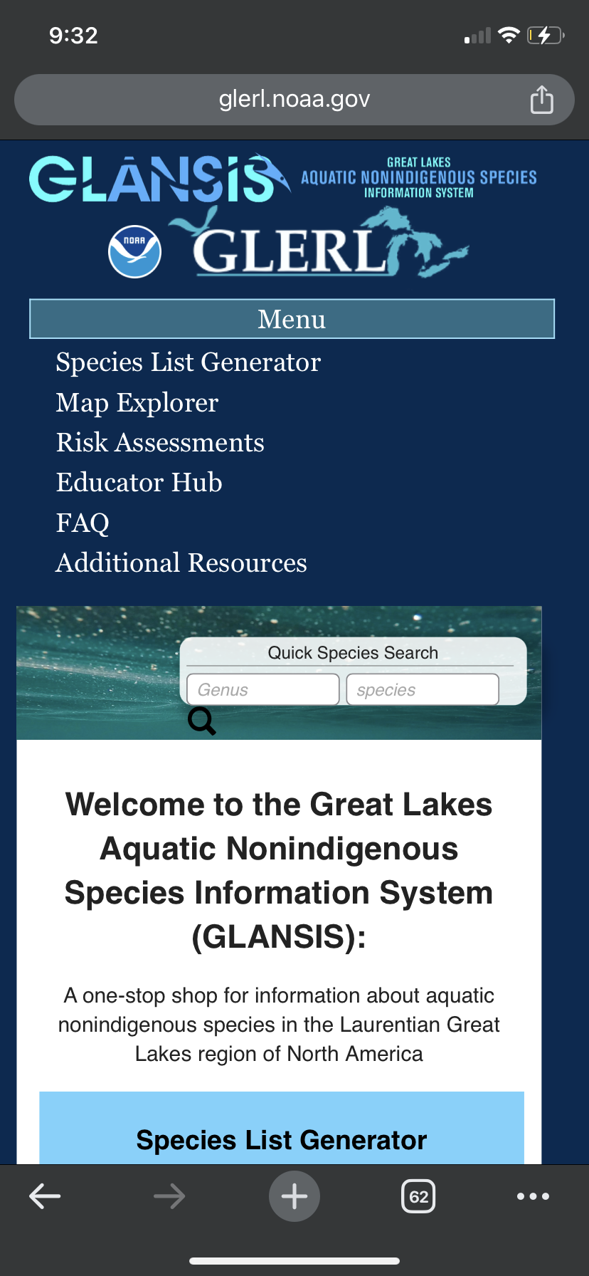
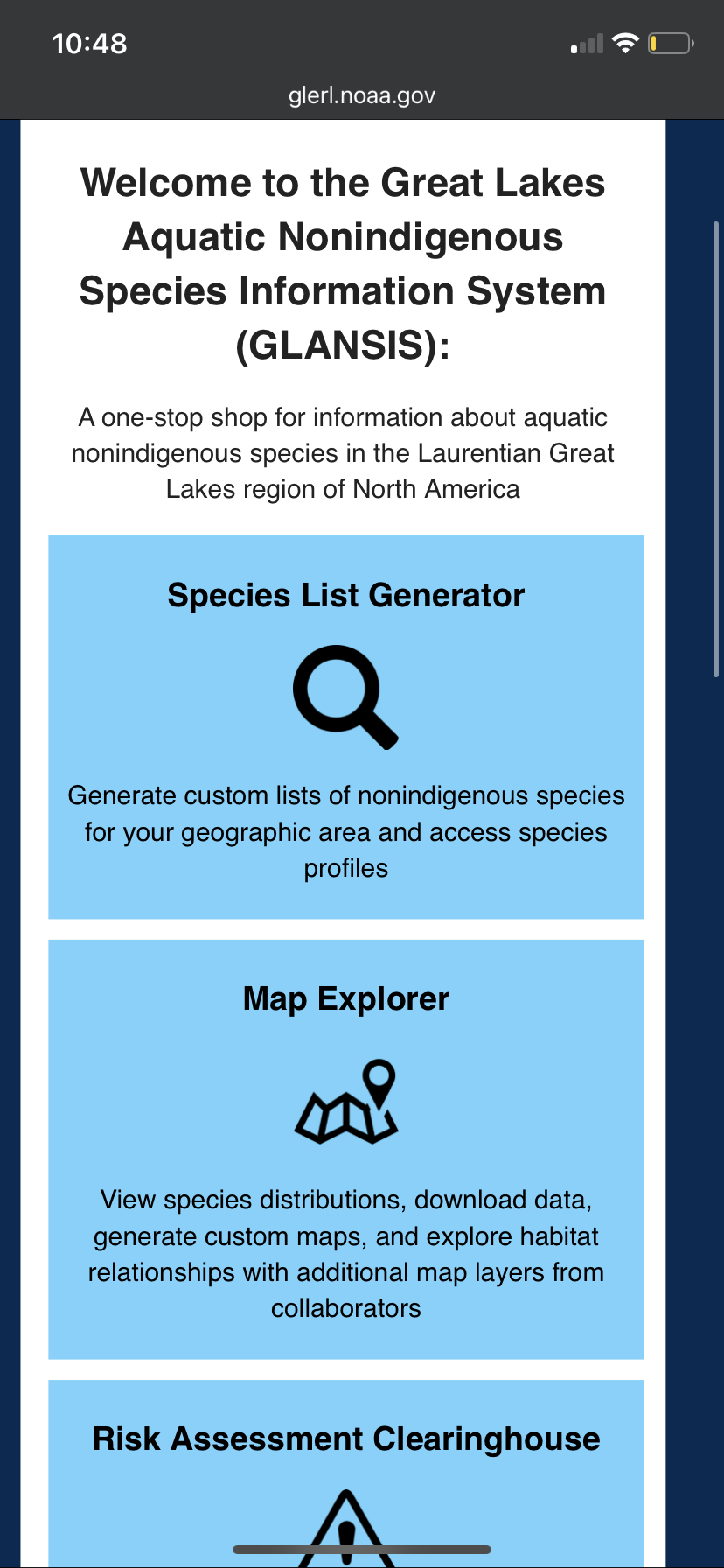
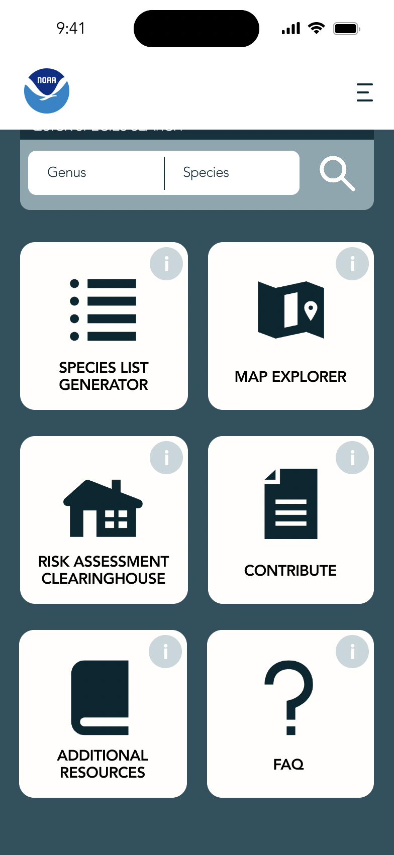
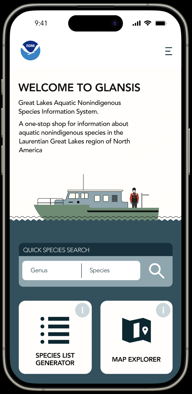
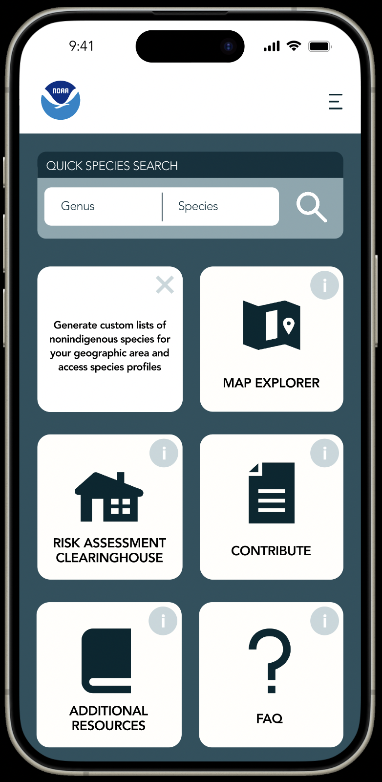
NOAA GLANSIS Class project where we collaborated with NOAAUnder NOAA, National Oceanic and Atmospheric Administration, GLANSIS’s (Great Lakes Aquatic Nonindigenous Species Information System) species list generator creates custom non-indigenous species lists and caters to a wide audience.
DURATION: 3 Months
TOOLS: Figma
ROLE: Product designer
INSTRUCTOR: James Rampton, Eric Gilbert
TASK: To resolve the challenge- the difficulty users encounter when attempting to locate the precise information they seek. There is an abundance of information within the system, organized in a manner that makes it hard for users to navigate efficiently and access the data they require

What is the problem we are trying to solve?
GLANSIS’s species list generator creates custom non-indigenous species lists but struggles with information overload and complex navigation. Users resort to inefficient email inquiries, straining resources and potentially driving them away.
To put it simply
We want to help users find information.Executive Summary: BeforeFor all stakeholders, there are these recurring problems
Analyzing the problem
NAVIGATION - Getting lost
A LOT OF TEXT - Mind was dozing off
FORMS - Hard to see, even with my glasses
User Scenarios To sum it up: Users are trying to find different kinds of information.
Researcher studying the amount of nonindigenous algae existing in the Great Lakes Region.
Resource manager looking for information on invasive species in their area, particularly those needing control.
Educator teaching students about great lakes ecosystems.
Nature conservationists are looking to gather information on native and invasive species.
My Previous Approach
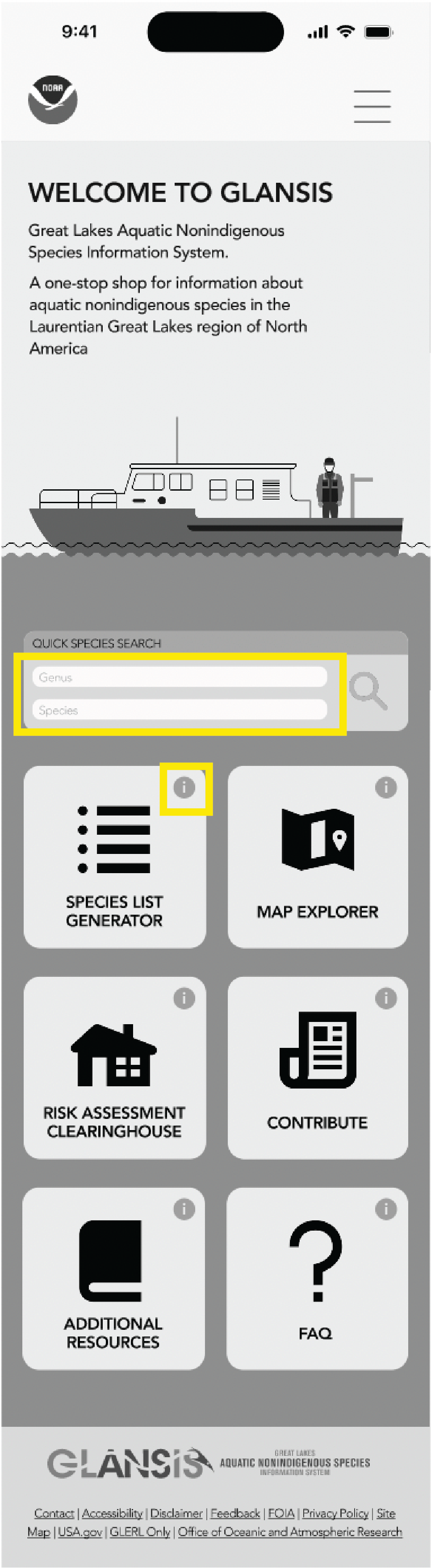
In an attempt to solve the problem, I create a user-friendly interface with tailored filters and improved search features for all potential users.
The feedback that I got:
Inconsistent icon and spacing
Icon and font sizes are too small
Misalignment
All of that was an easy fix, but I wanted to learn more, so from my instructors, even though they liked my design, there is one thing that I concluded that was missing.
Clickable prototype and Usability testing
After fixing the wireframes from the feedback that was given, I created a clickable prototype.
Feedback from the instructor: The navigation to all the screens was very intuitive!
Users were given the task to:
-
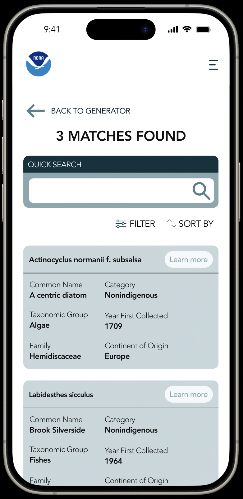
The user clicked on the species list generator but struggled to find the navigation to the search results page, possibly due to too many filters. They eventually clicked on "Genus/species" and quickly found and completed their task by clicking on the profile of Petromyzon Marinus Linnaeus after clicking on ‘Learn more.”
-
The user was on Petromyzon Marinus Linnaeus's profile page when asked to navigate back to the homepage. They clicked on the NOAA logo, which took them to the species list generator. They then clicked on the NOAA logo again to return to the homepage. Despite the redundant process, the user completed the task quickly and did not seem to have trouble finding their way back, demonstrating the connection between logos and the homepage.
-
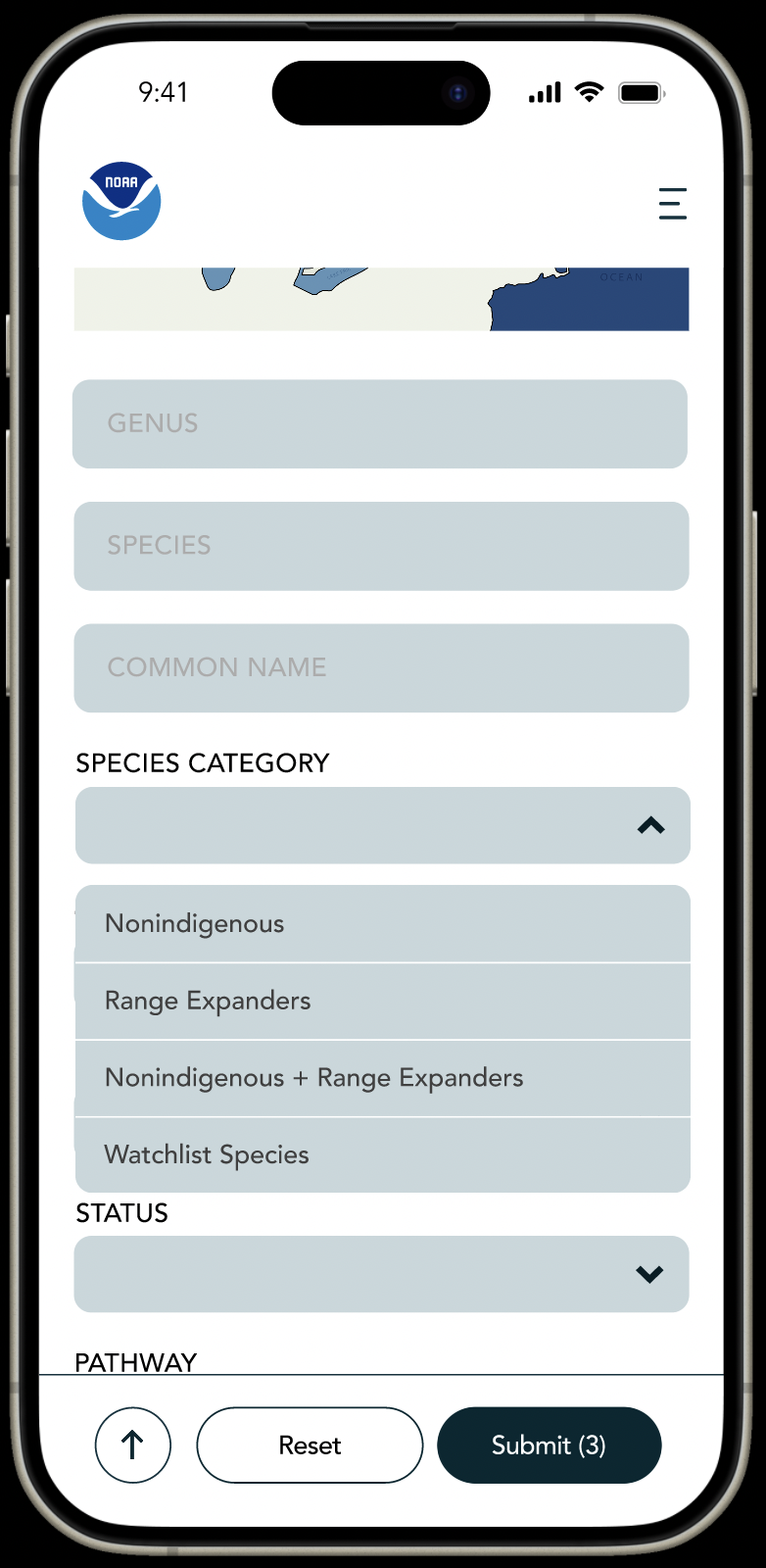
The user was initially confused about the task and mistakenly used the submit button to navigate to the search results page. After realizing the error, they used the back button to return to the species list generator without difficulty. They then located the species category filter after some scrolling and successfully used the submit button. The user seemed to struggle a bit due to the numerous filters available.

Navigation and visual design were doing great,
ONE KEY FEEDBACK WAS THAT:
I focused more on visuals than the functions
I started brainstorming, which I should have done more of in the beginning but that is beside the point,
What functionalities can I include, so that users can find the information that they need more easily?
Regardless of any of our stakeholders’ goals, they need easy navigation to find the different kinds of information that they need.
Tackling Navigation
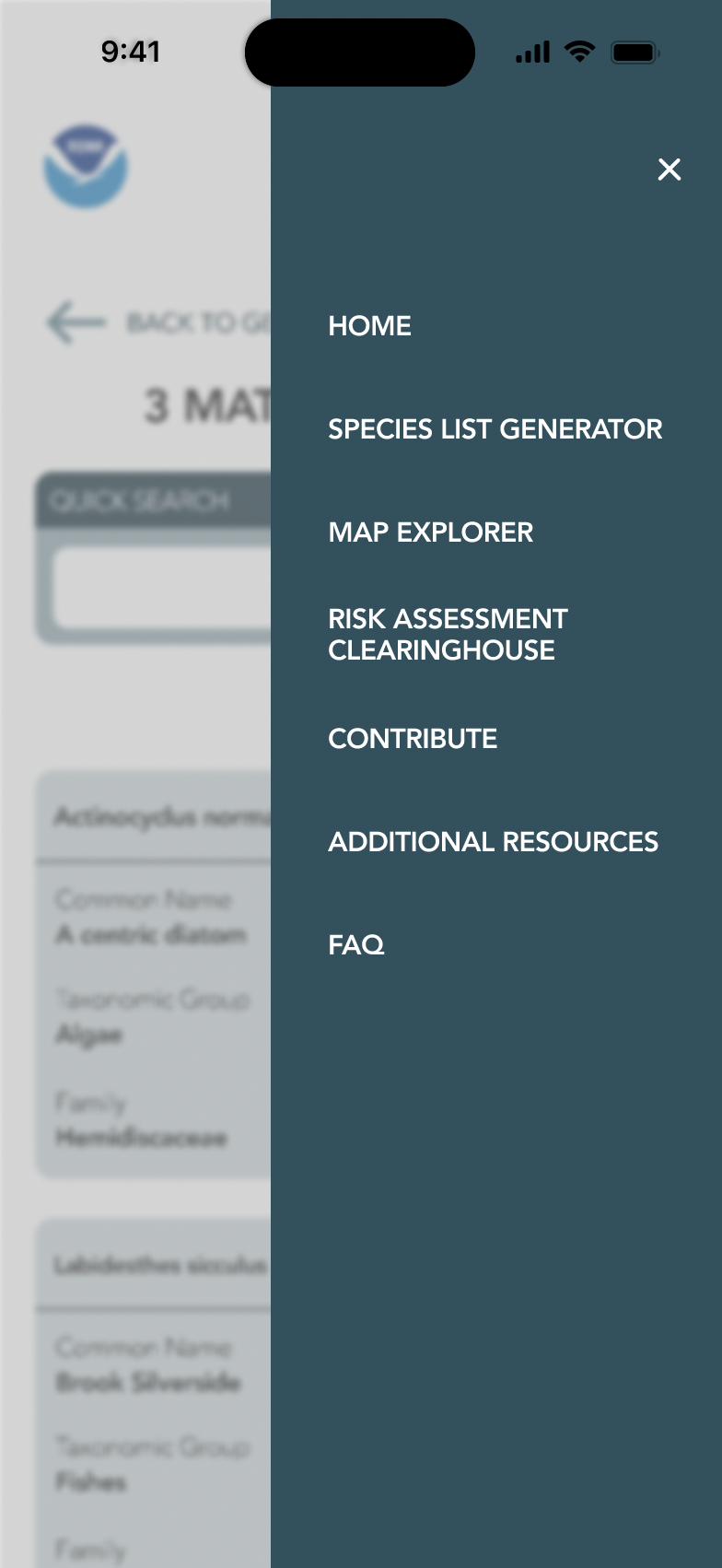
GETTING LOST IN THE WEBSITE
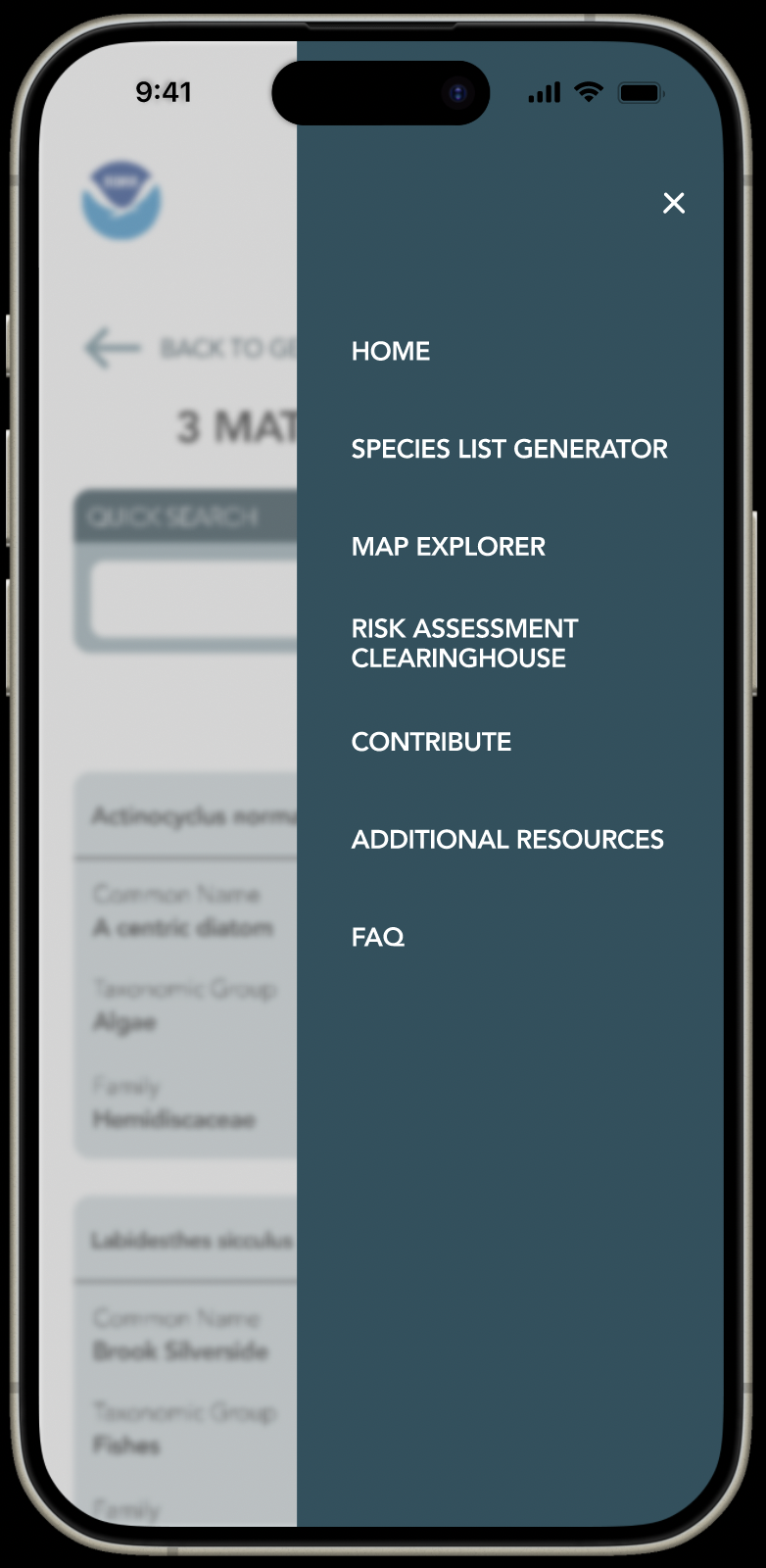
Why Hamburger 🍔? Target is easier to reach.
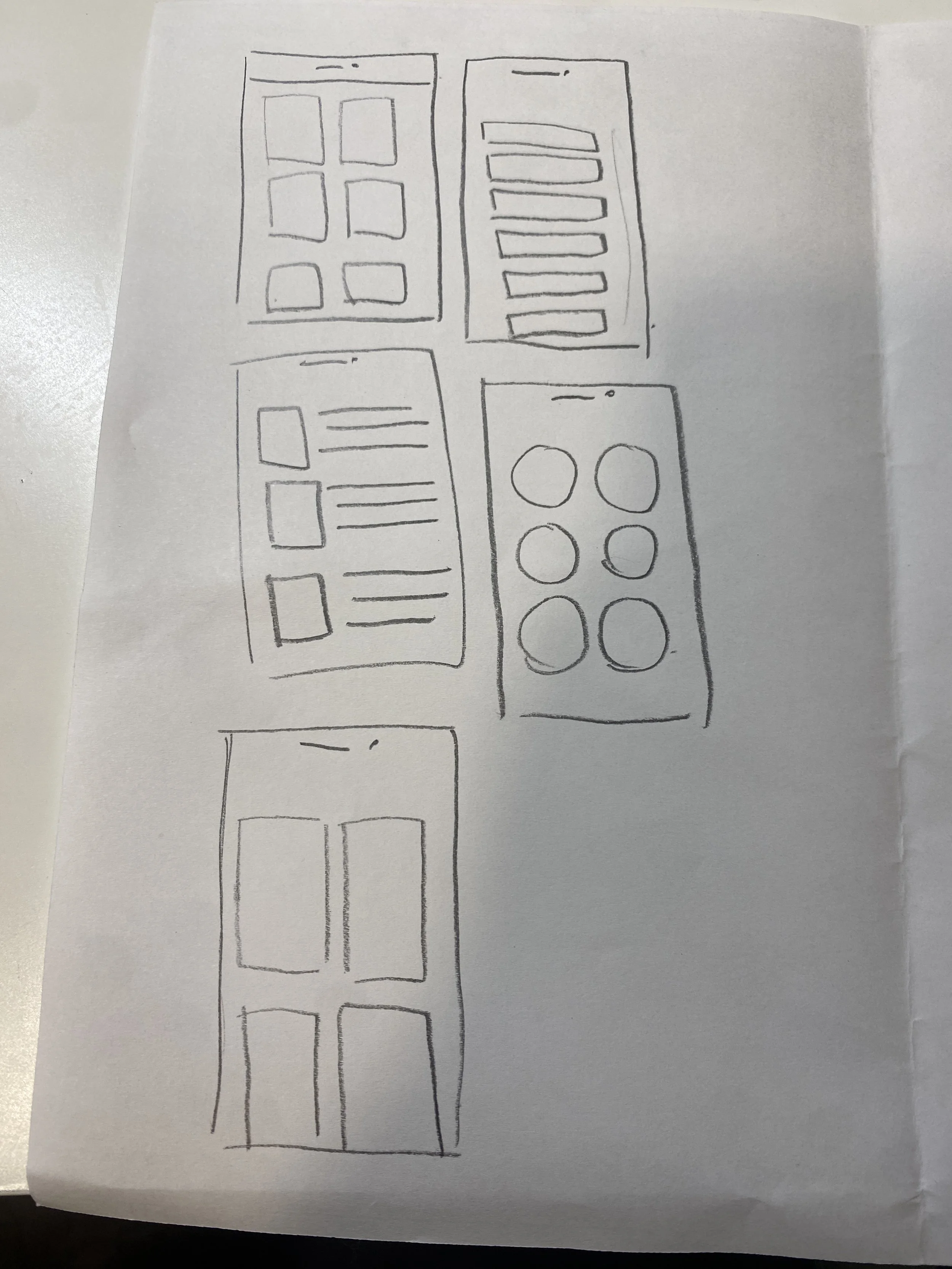
ITERATIONS of Navigation bar:
Tab bar → Full-screen Navigation → Hamburger navigation
Full-screen navigation with centered text, even though visually appealing, is hard and stretching for the one-handed user to access.
SCROLLING…
ITERATIONS of Navigation bar:
Card view → Table view
I wanted all the categories to be in one place for easy access. I sketched out some possible options.
NOAA had explanations on the different categories, so I wanted to include that with an Info icon to consolidate space.
Full Screen Navigation
Making target easier to reach 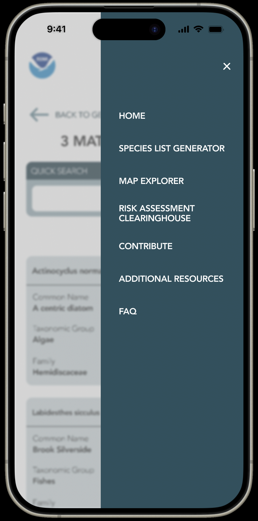
Navigation Bar
Seamless Navigation: Your Shortcut to Success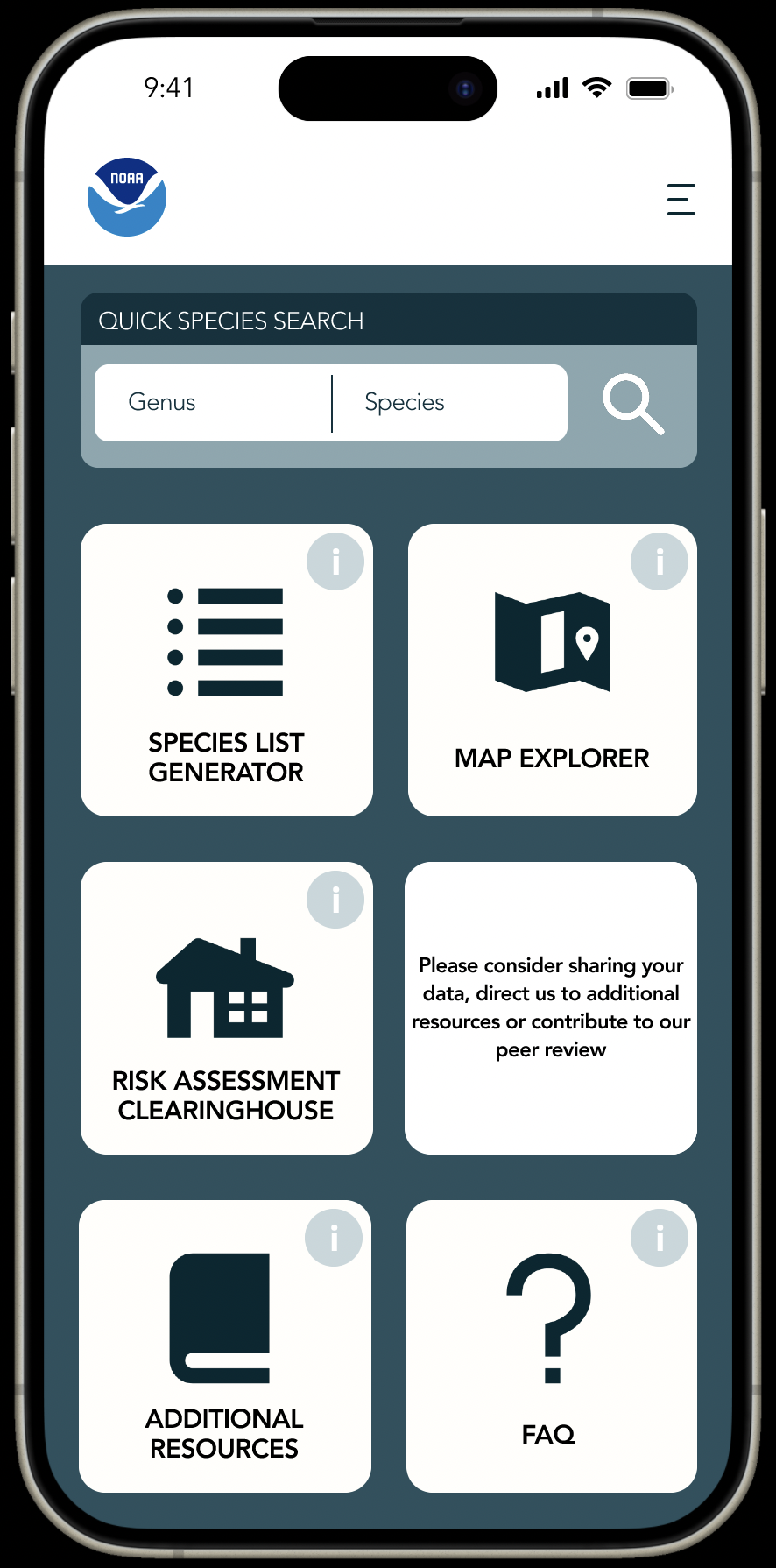
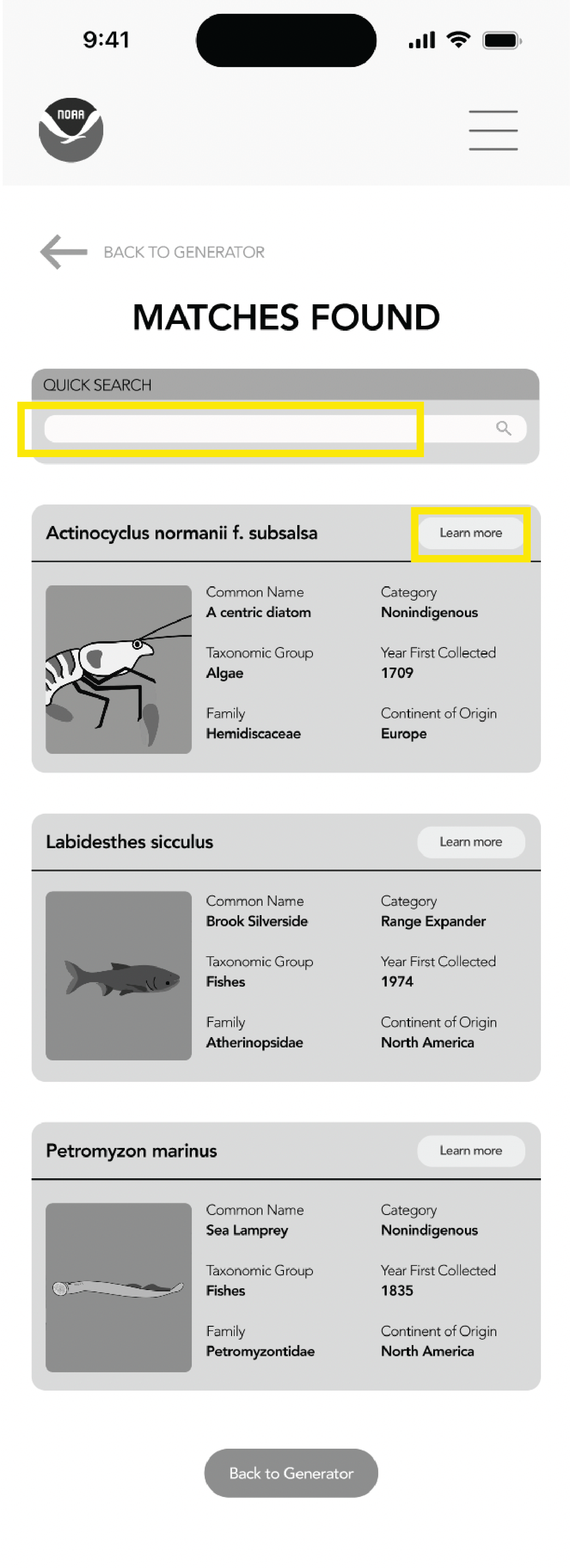
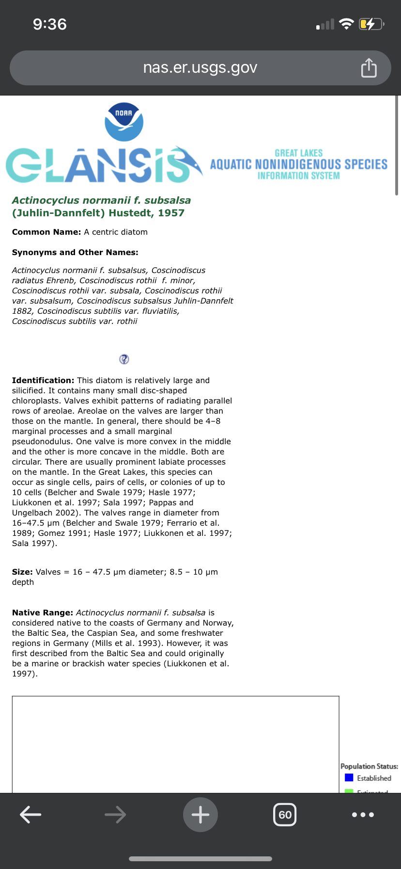
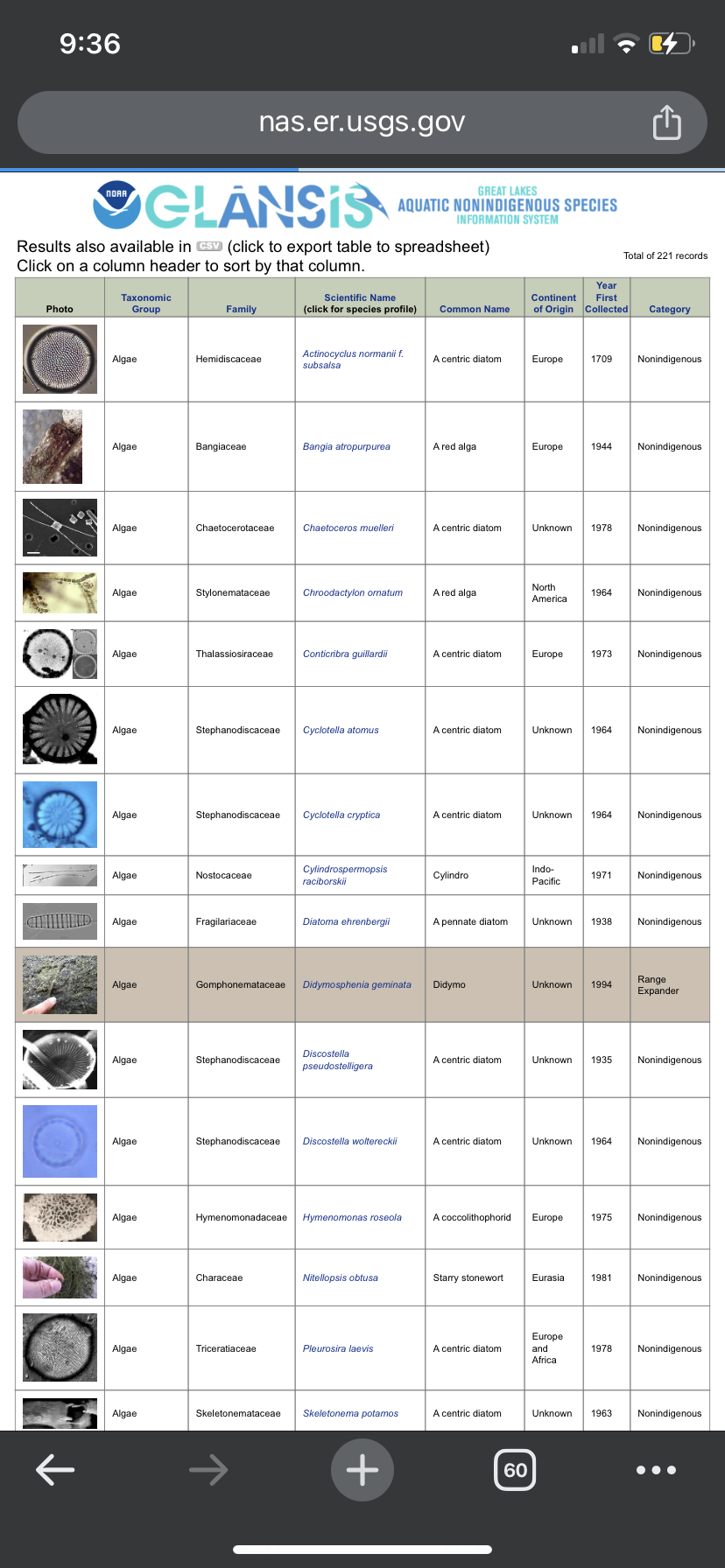
A resource manager trying to find the status of a species needs to be able to spot the information efficiently. Previously, they had to scan the entire webpage and use the bolded text to get their desired information.
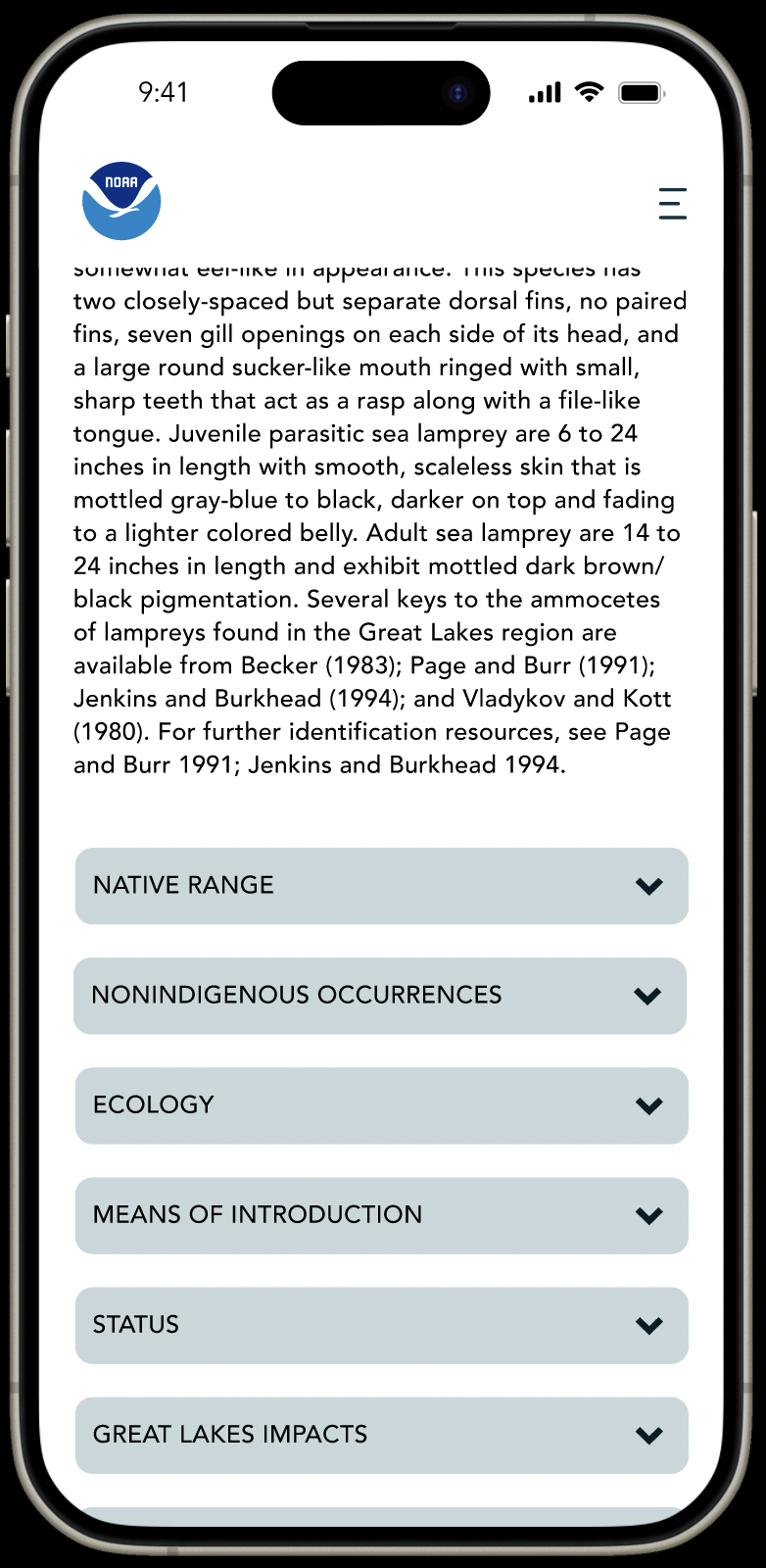
Making Information Digestable
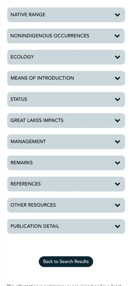
TEXT TEXT TEXT - A LOT OF TEXT
So much text that it is hard for our users to find what they need.
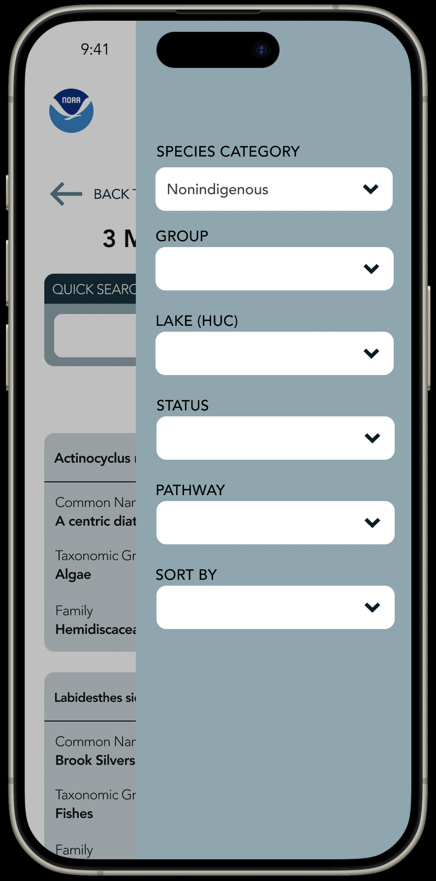
Consolidating text into a drop-down menu
Researchers can easily find the information that they need.
Minimize Cognitive Load
Space Efficiency
FORMS ARE HARD TO READ
Impossible to see, even with my glasses, and unclear where to click to follow up
Call to action button
Making the font size bigger
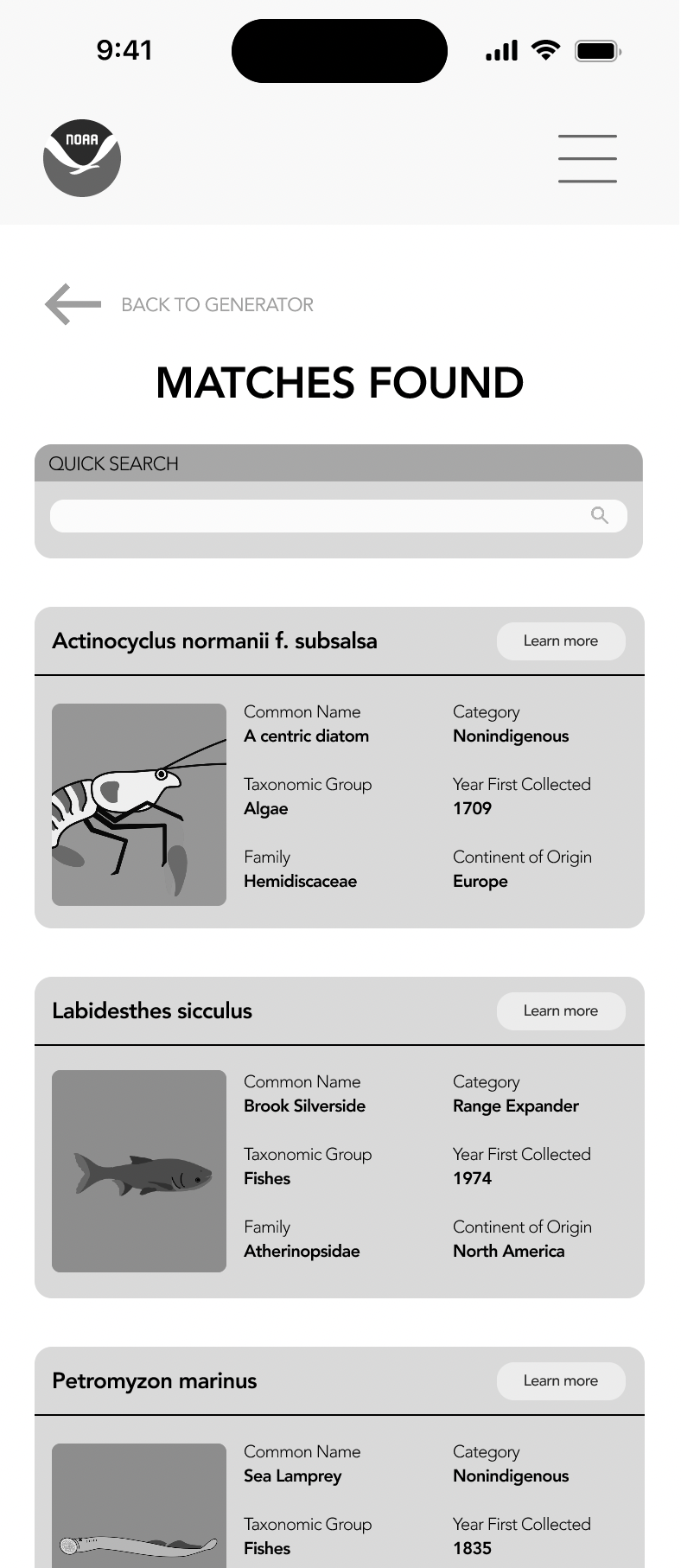
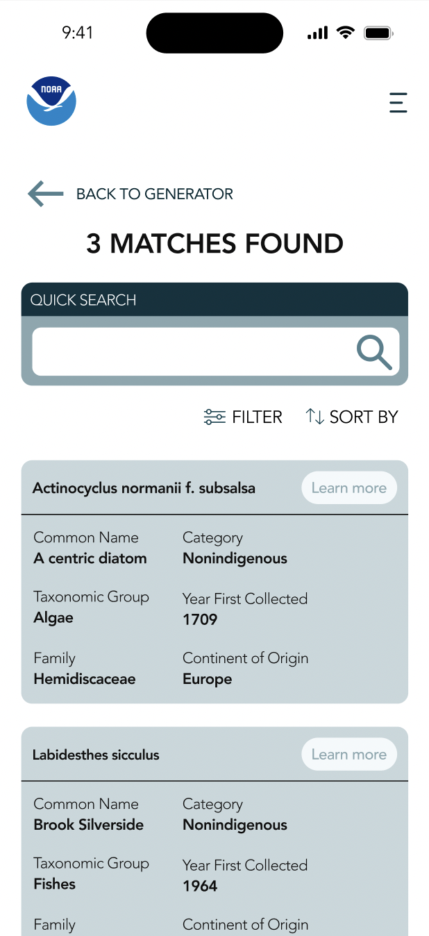
Chunking information into cards
From the second to third iteration: An insight that NOAA gave us is that users don’t rely on photos to find the species that they want.
Chunking information into cards, the human mind can more easily process information when it's organized into smaller, meaningful units.
Drop Down Menu
Customize your experience
Chunking Information
Master complexity: One chunk at a time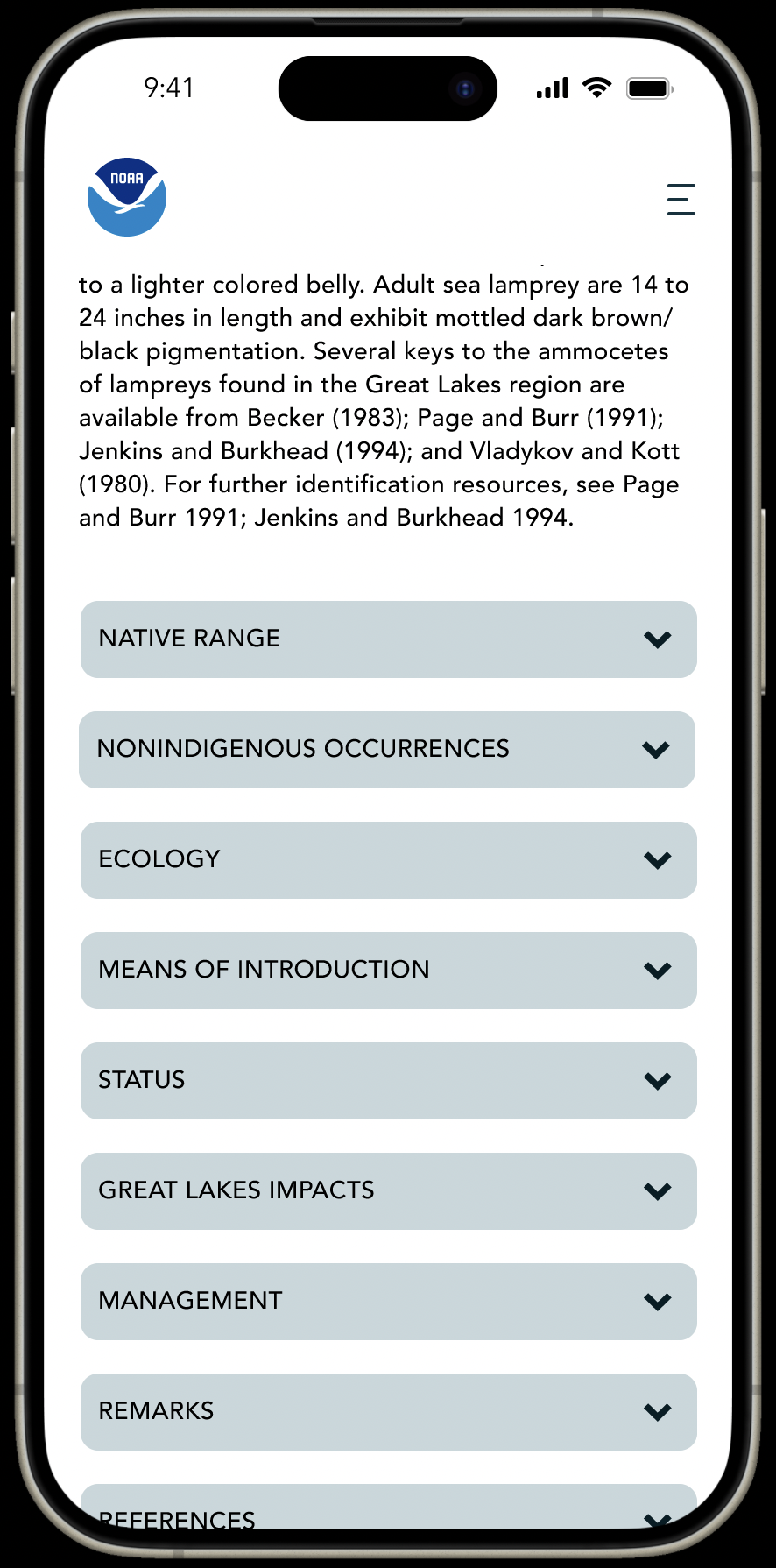
Nature conservationists need to be able to switch between native and conservation status for species quickly. They need to be able to edit without having to enter the form information again.
Making Changes easily
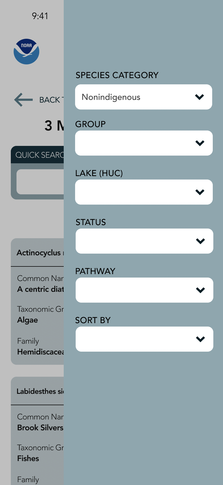
FORM SUBMISSION TROUBLES
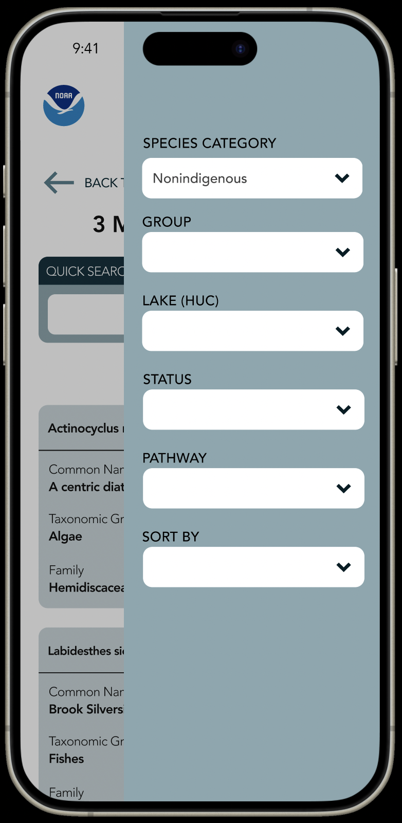
The frustrations when users need to resubmit the generator form over and over again, having to toggle between different windows, it is inefficient and hard to use.
I did not account for this in the first iteration. To solve this, I added a filter that users can use to change their preferences easily without having to go back.
Easy to edit Filter
No More Form Resets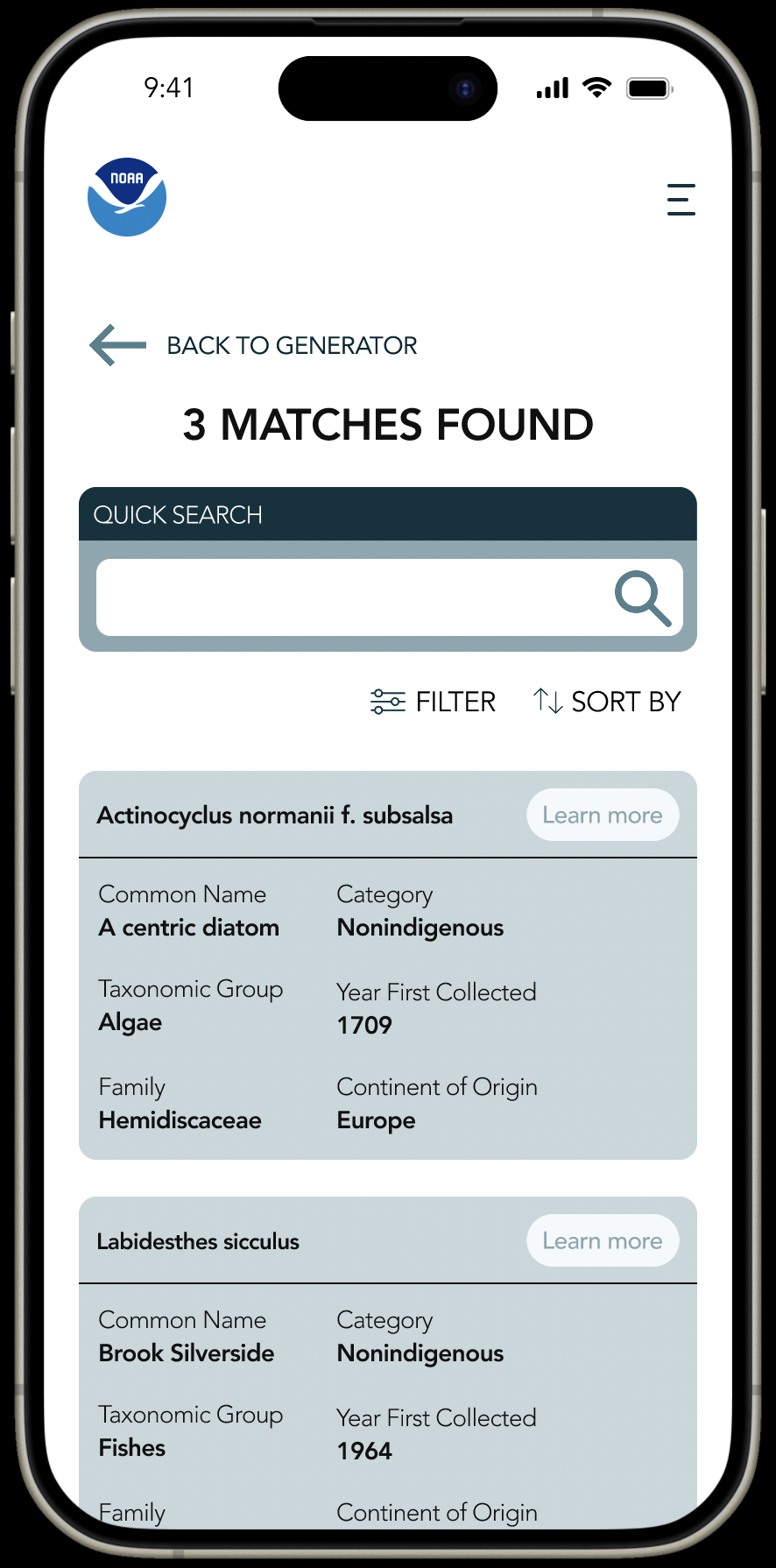
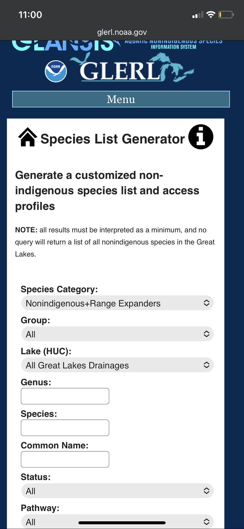
Researchers studying the number of nonindigenous algae existing in the Great Lakes Region and having to count the number manually.
Showcasing Results
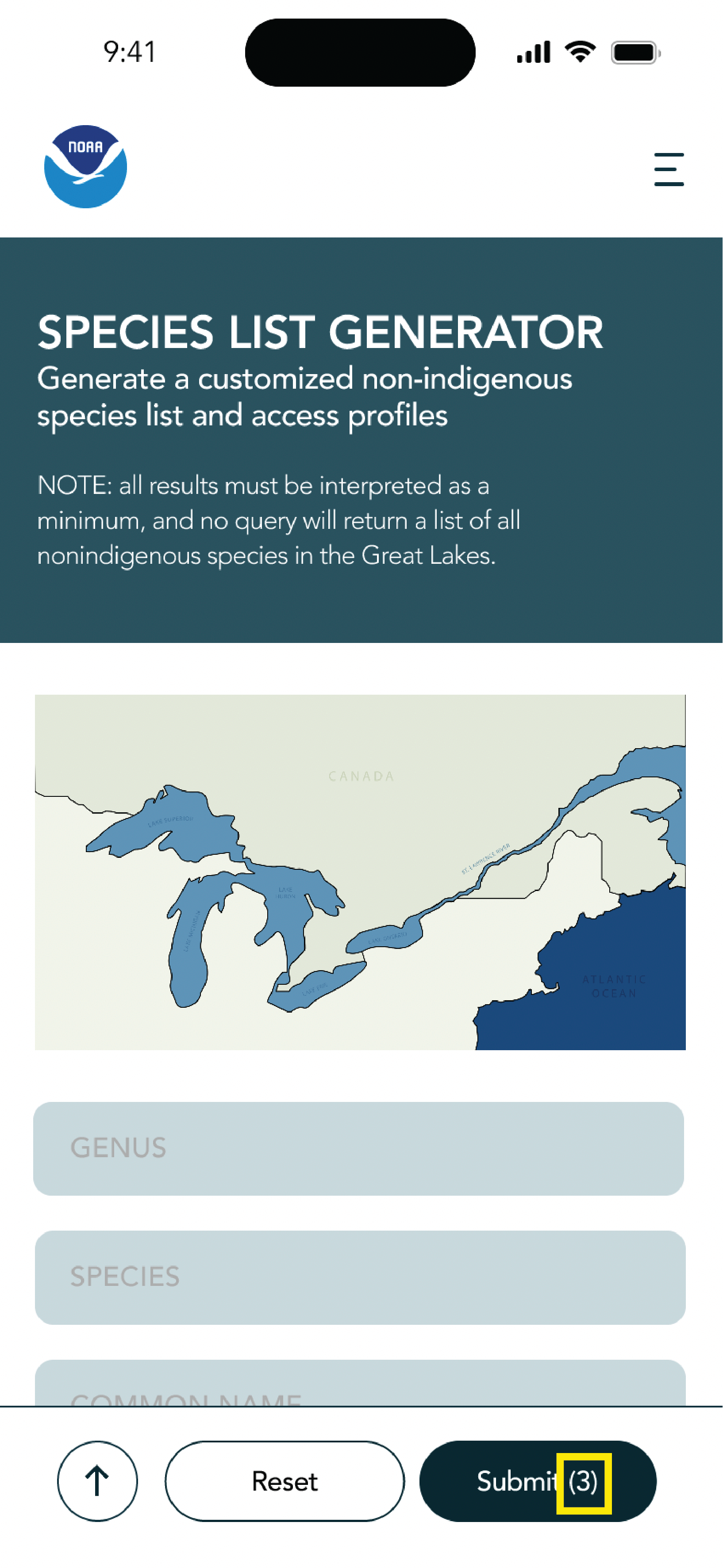
SAVING RESEARCHER TIME
Sometimes researchers just need the amount of result, by showing it on the species generator, they no longer need to navigate to the result page.
Feedback: The representative at NOAA really liked this design!
Results Count
Instant Summaries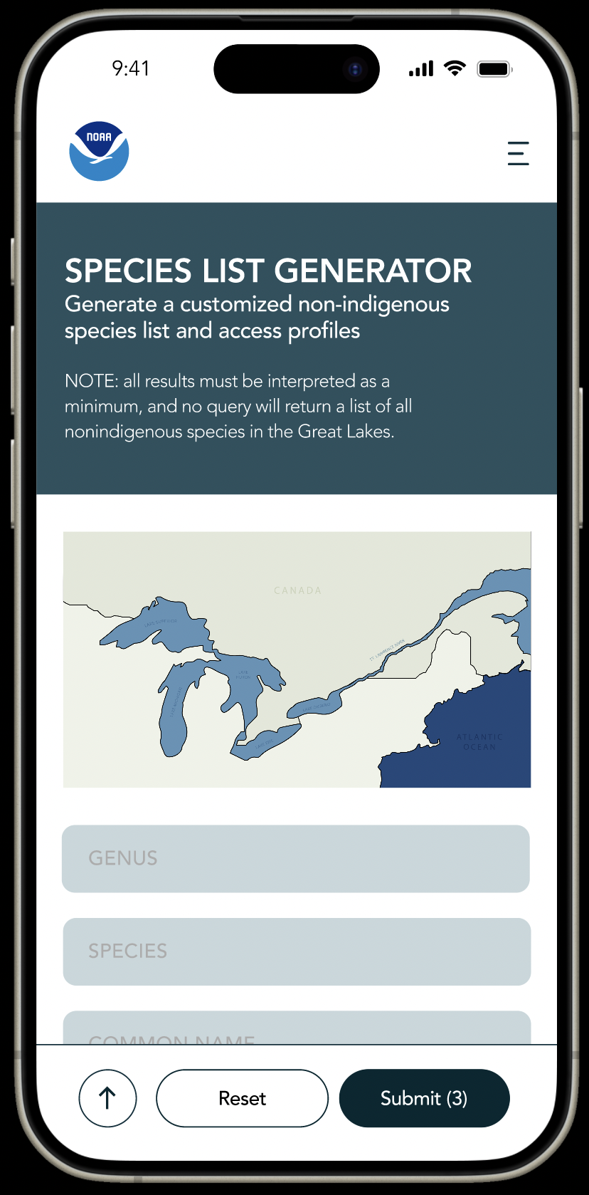
Executive Summary: AfterHOW DID I RESOLVE IT?
FINAL DESIGN- ALL TOGETHER
Reflection
Things that I learned…
The functionalities are IMPORTANT in combination with visuals
Work with a real-life client, understanding their needs and turning it into reality
What I would do differently…
More user research and testing to test out some of my hypotheses. To get data to back up my design.
To think more outside of the box. To create freely then hone in.
My favorite part was…
Creating the Mockups and learning more in-depth about prototyping
The iterations and seeing my progress
Practicing my creative problem-solving skills