

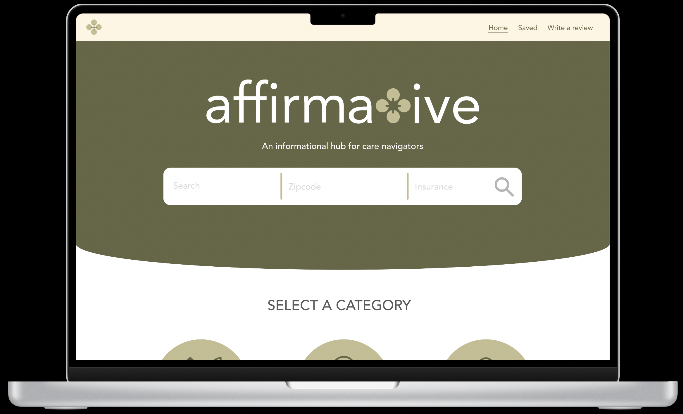
AffirmativeProduct DesignAffirmative is a healthcare startup that aims to help the Trans community through their healthcare journey by leveraging AI and care navigators.
DURATION: Sep 2023 - Ongoing
TOOLS: Figma, Illustrator, Google Slides
ROLE: Product designer
TEAM: Founder Sasha Kolodkin | Product Manager Matt Liu | Developer Zhenqi Wang | User Researcher Seoyoon Chang | Business Analyst Kashima Lunawat | Developer Johnny Shen
OUTCOME: Won first place in the University of Michigan’s +Tech Innovation Jam and first place in the Michigan Business Challenge 2024. Currently in the fundraising stage.
GOALS:
Build a scalable platform for care navigators and patients
Create a product that reduces the amount of time care navigators need to spend on finding adequate healthcare providers and insurance providers.
Provide a streamlined and gamified experience for care providers and patients.
Decoding the Trans healthcare madness...There are two parts to this story.
PHASE 1:
+Tech Innovation Jam
Where all chaos broke loose
A medical provider resource hub vetted by Trans community for the Trans community.PHASE 2:
Michigan Business Challenge
I think I know what I'm doing?
AI powered search inquiry system designed for care navigators.It’s a long story so grab your popcorn 🍿
⚠️ Spoiler Alert ⚠️
In case you’re in a rush, here’s a summary of the story.
Phase 1
RESULTS: We placed first in the +Tech Innovation Jam out of 50 teams. Care navigators appreciate the condensed information and specific filters on the website. They found the feedback form refreshing and tailored to their experience. The judges liked the idea and are interested in seeing it developed further technologically.
WHAT WE BUILD: We interviewed Trans care navigators and built a Trans healthcare resource hub that optimizes search by creating specified filters for the Trans community to find community-vetted medical providers.
REFLECTION: It was a period of growth and realization, I was new to UI UX design. I didn’t know what questions to ask to build for specific users. I was learning about UI UX principles and research methodologies along with the competition. It was confusing, but with the questions I had, we entered phase 2.
Phase 2
RESULTS: We placed first in the Michigan Business Challenge. According to the model we built, it would reduce the amount of time spent on finding a medical provider by 66%.
WHAT WE BUILD: An AI-powered search tool for care navigator to optimize their workflow in searching for an adequate medical provider.
REFLECTION: Communication with different people and making sure everyone is on the same page is critical to ensure our visions align and are crucial for implementation. I wish we had more time to see how a care navigator uses this tool and can make changes accordingly.
PHASE 1
+TECH INNOVATION JAM
~ less than 6 weeks
We had this idea to help the Trans Community, but where do we start?Metric of Success: Care navigators enthusiastically share their data with us, indicating the platform's appeal and our outreach effectiveness. High user engagement, measured by active reviews and feedback.
My story started with Affirmative in September 2023. Due to a class conflict, I had to miss the initial groupings, by luck, I ended up grouping with Affirmative for +Tech Innovation Jam.
From the get-go, the team had a loose idea from our founder, Sasha, who personally struggled through the Trans health madness:
We want to help the Trans community. But how?
Setting the scene… During the summer of 2023, we ran a pilot on the amount of time a Trans Care Navigator spends trying to find an adequate medical provider.
As it turns out 85% of a care navigator’s time is spent trying to find an adequate medical provider.
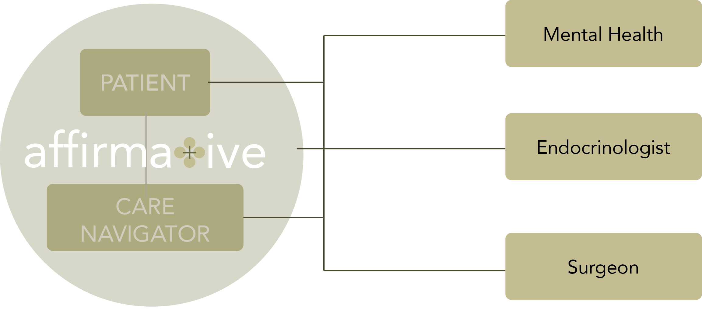
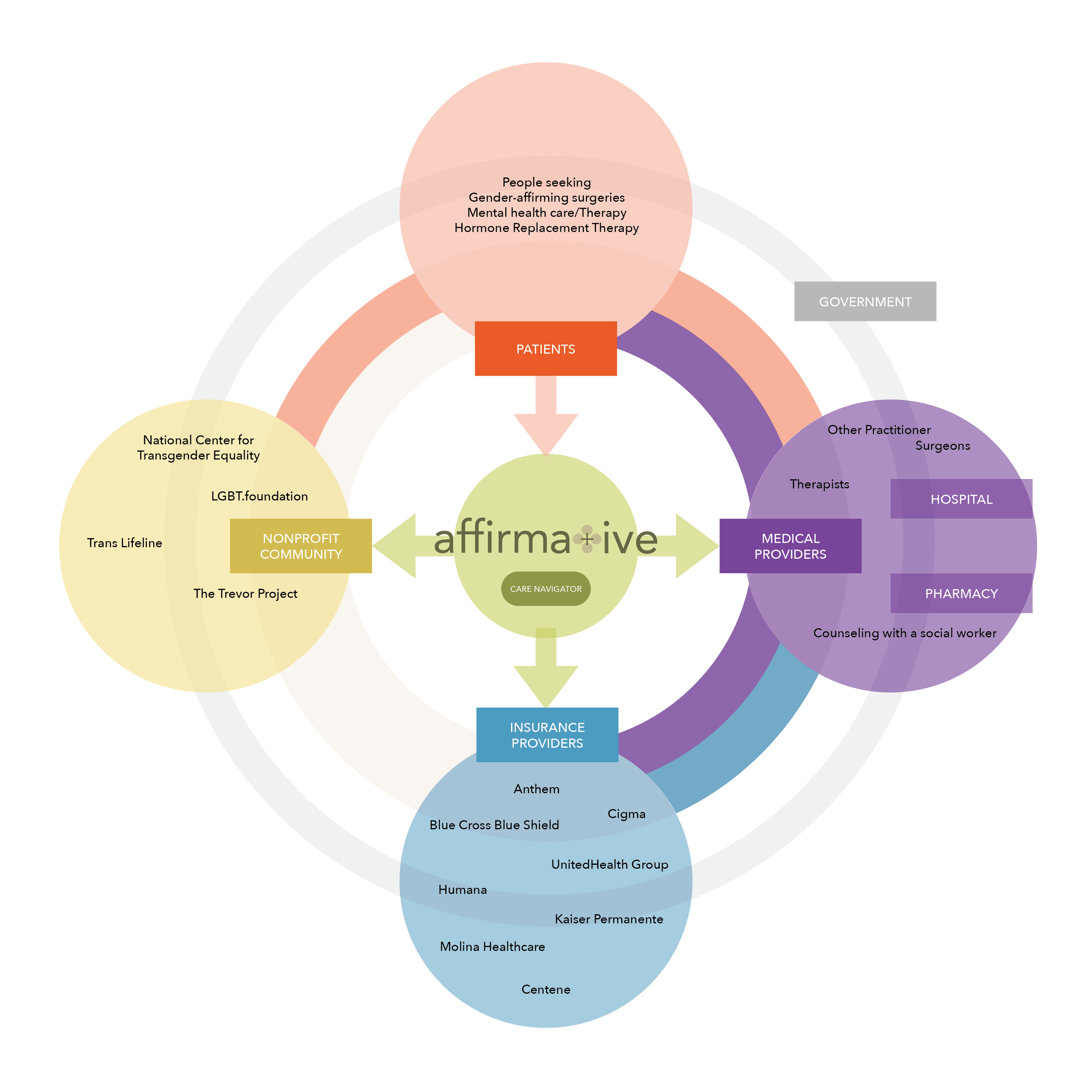
There is this solution to the Trans healthcare madness: Care navigators.
Trans care navigators serve as a vital link between transgender individuals and healthcare systems. They possess firsthand knowledge and experience within the trans health care community, making them valuable in identifying pain points or challenges.
So, we went straight to the source to identify the problems.
Identifying Pain pointsConducted one-on-one interviews & Pilot tracking with Trans care navigators.
The founder conducted Pilot tracking over the summer and I did interviews, comparing our notes we found out that:

Care Navigator side
time-consuming process of finding resources, which limits care navigators’s ability to communicate effectively with patients.

Trans Community
Challenges in accessing specialized care. They rely on online platforms, but the current doctor review websites often lack transgender-focused resources and the reviews are not reliable.
If you want to learn more about the pain points:
-
Insurance Policy Instability: The constantly changing insurance policies. The unpredictability can lead to confusion and financial burdens.
Legislative Changes: Hard to stay informed about their rights and healthcare options.
Costs: High medical expenses for gender-affirming procedures
Manual Resource Discovery: Manually calculates insurance coverage and searches for financial resources to cover their healthcare needs.
-
Shortage of Skilled Surgeons: Lack of healthcare providers, specifically surgeons, who are trained and experienced in gender-affirming procedures.
-
Filtering Unwelcoming Medical Care: A need for a system that accurately identifies and filters out healthcare providers who may not be welcoming or inclusive to the transgender community.
Profiting in Healthcare: Medical professionals profit off the transgender community, particularly through practices like requiring multiple therapy sessions for support letters that are required for gender-affirming surgery.
-
Diverse Insurance Policies: The variability in insurance coverage, even within the same insurance company.
-
Care navigators invest a significant amount of time reading through insurance policies and reviews of healthcare providers.
Potential SolutionsDevelop a reliable resource for keeping up with changing insurance policies and legislative updates
Greater transparency in pricing for gender-affirming procedures to help individuals plan financially
Establish a directory or ranking system for healthcare providers, indicating their inclusivity & expertise in transgender healthcare.
Collaborate with insurance companies to standardize and simplify coverage for gender-affirming care.
Promote awareness and education around transgender healthcare rights and options to empower the community.
We opted to address the most readily accessible opportunity.
Through interviews, pilot tracking & research, we concluded that the best way to help is
a resource hub tailored for the trans-community.
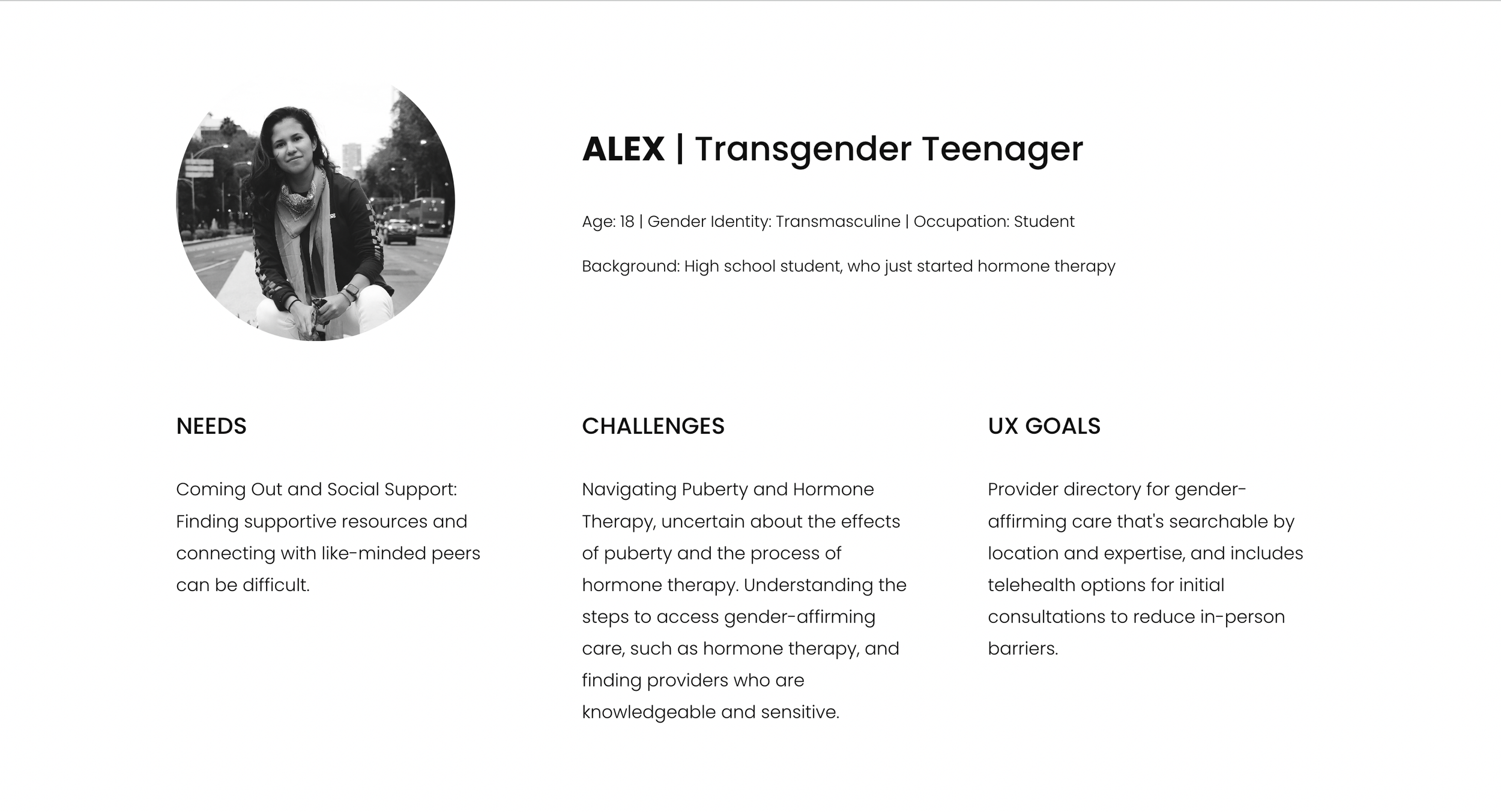
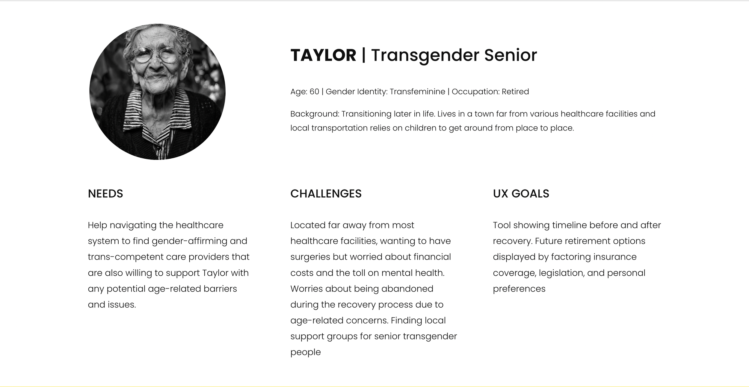
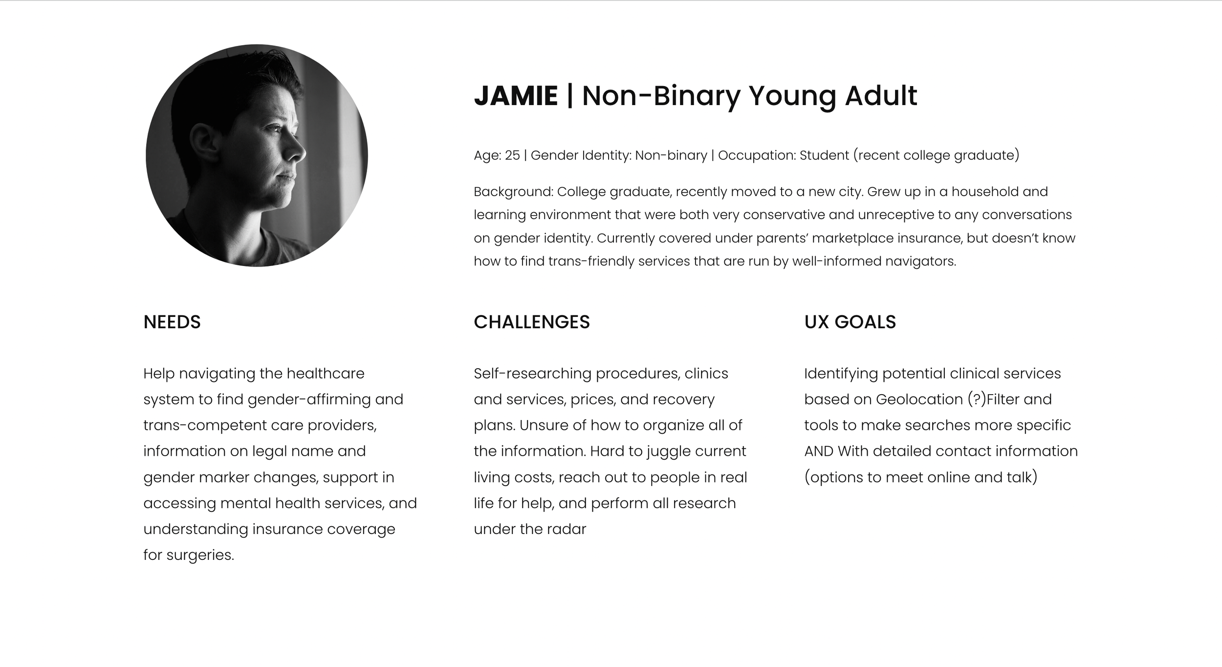
We created User Personas that are based on Trans Community.
CHALLENGES/PAIN POINTS:
Uncertainty about certain procedures/ Inconvient locations/ Cost / Organization of all the information / Privacy / Lack of community
Competitive Analysis
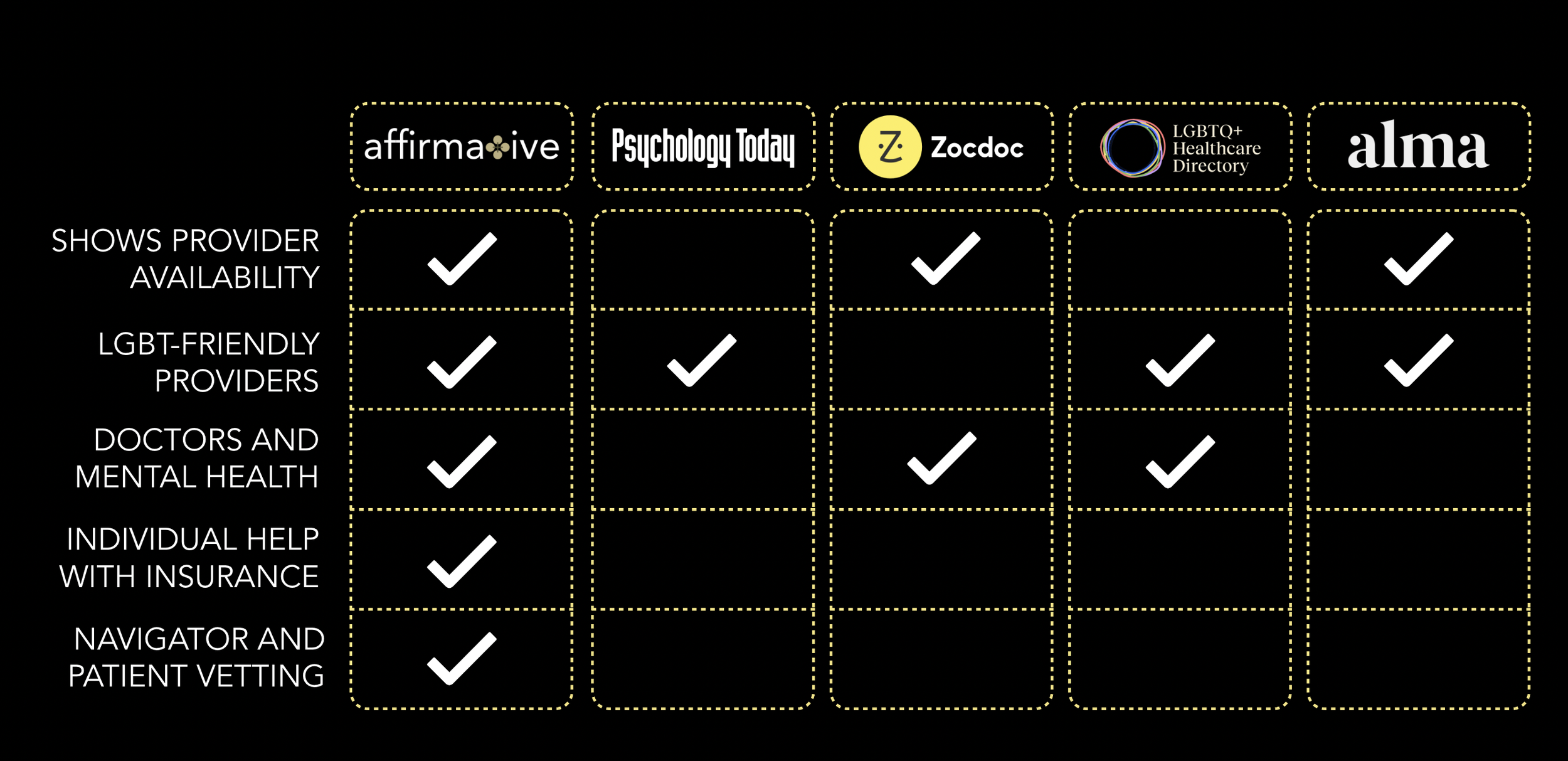
Based on interviews with care navigators, building off of user personas, and differentiating ourselves from the market, we decided to create these key features...
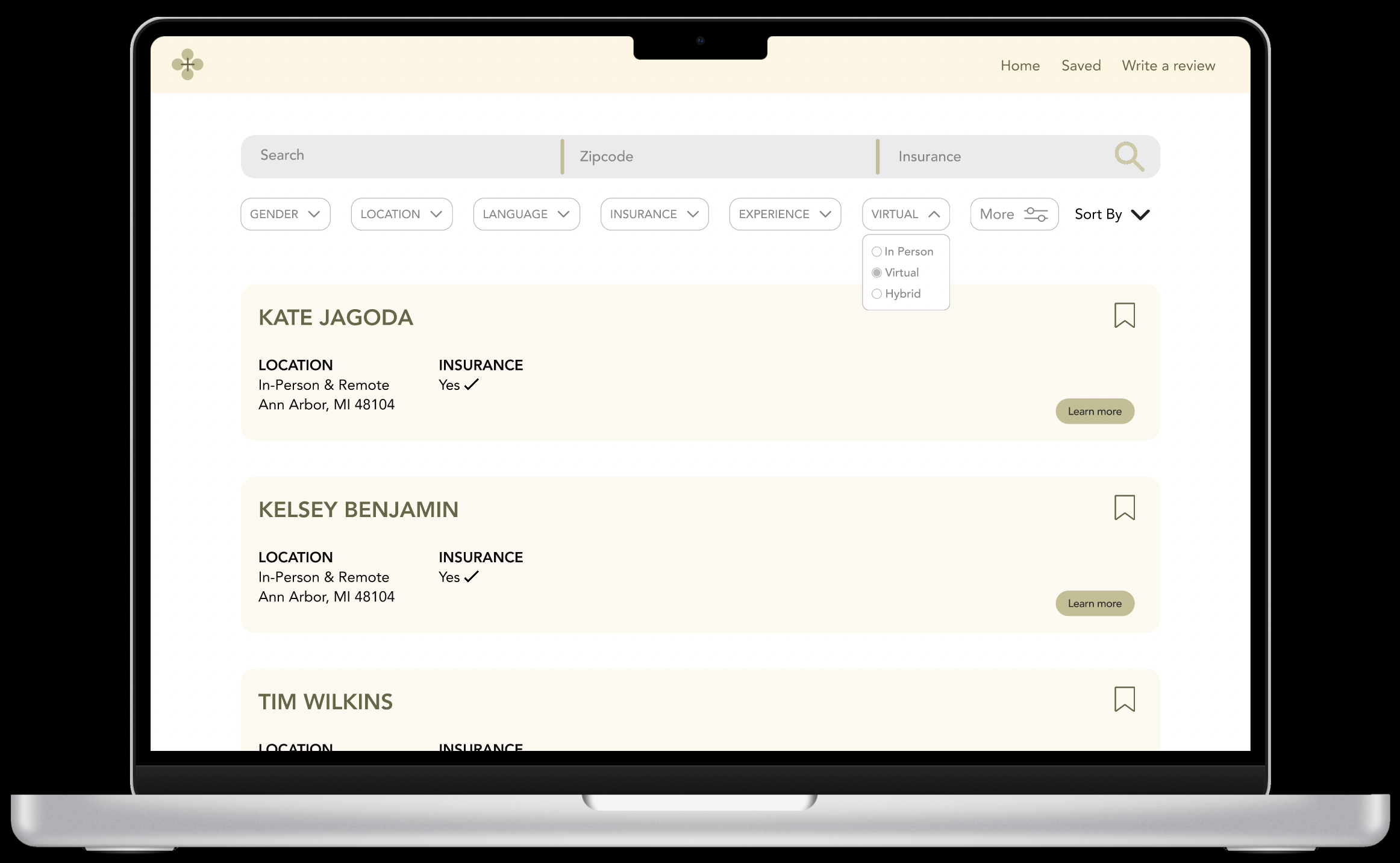
Some basic functions that our user personas needed:Quick and easy search function:
Users can use this to search and find medical providers
Showing doctors and mental health providers all in one place. Care navigators or patients no longer need to travel to 5 different websites to find the information that they need.
Bookmark:
To save preferred medical providers for later review
During our research, care navigators expressed a need to save respective medical providers and have them accessible.
Our key differentiating functions:Tailored filters for the Trans community:
To find a suitable medical provider that suits their need
Reflects the need for tailored searches based on gender-affirming care, LGBTQ+ friendliness, and specialized services sought by the personas. Moreso, finding gender-affirming providers closest to our personas’ location, ensuring convenience and accessibility.
Ranking System:
Develop an algorithm for assessing providers based on professionalism and LGBTQ+ inclusivity, ensuring accuracy in their friendliness verification.
Responds to the need for assessing provider friendliness and professionalism, derived from the personas' desire for reliable and trans-inclusive care.
Feedback from the community:
Collect insights via structured and tailored questions, contributing to the underlying ranking system.
Let the users build a community by trusting one another’s experience and ensuring care quality.
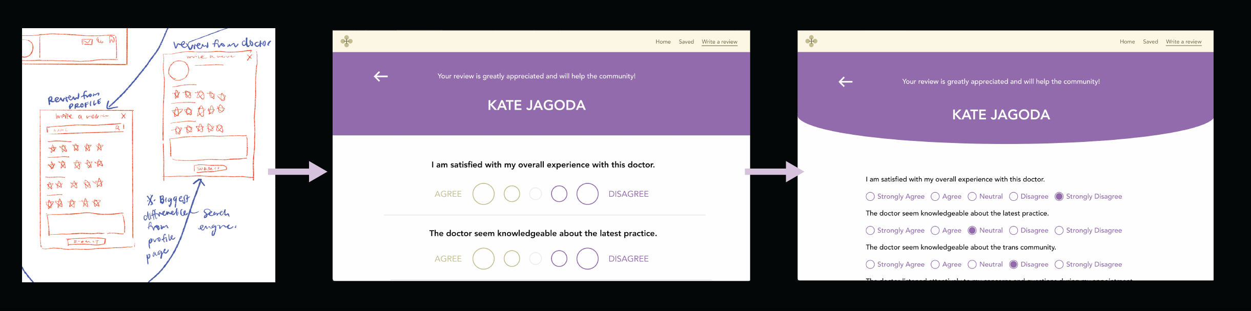
We were short on time, so I got to sketching. We started building immediately. Building in filters, community-based feedback, and fed into the ranking system…
Rough sketches
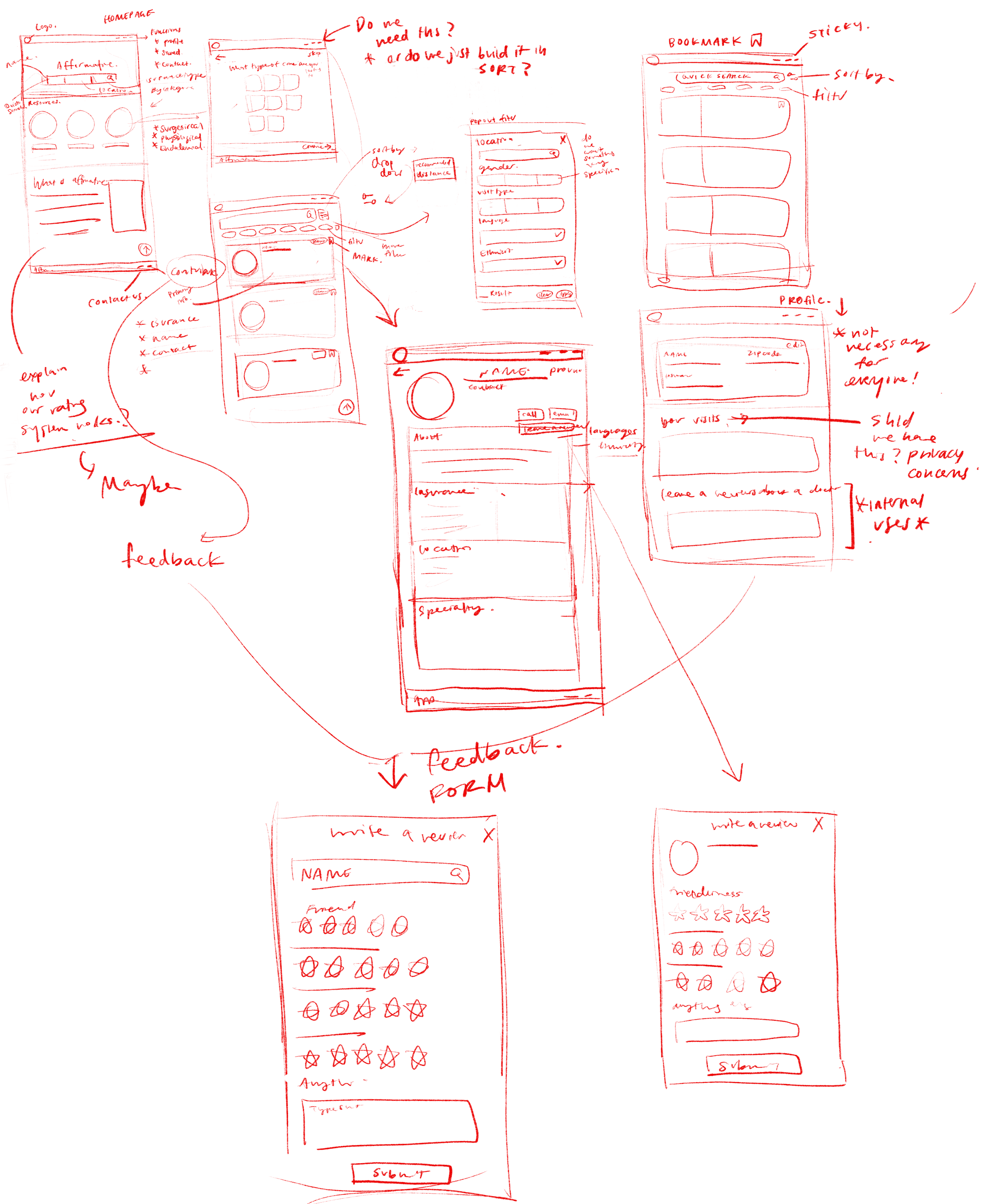
Key decision: Feedback Form
How do we get the best feedback?
Deviated from a 5-star rating system to a tailored list of questions to get a more accurate assessment of the medical provider.
Our ultimate aim is to create a positive feedback loop within the community. These efforts are directed towards building a sustained and supportive platform that serves and empowers the transgender community throughout their healthcare journey.
Why did we choose to deviate from a 5-star rating system?
Subjectivity: Ratings are highly subjective and influenced by individual experiences, biases, or emotions
Limited Context: Ratings lack context
Incentives for Extreme Ratings: Some users might leave exaggerated ratings—either overly positive or negative— undermining the credibility of the entire rating system.
The questions are specifically designed to discover whether a medical provider adequately serves the Trans community. These targeted inquiries set our review apart from others, focusing on aspects crucial for assessing the provider's suitability and inclusivity for Trans individuals.
Usability testing
Within the short time frame, we have three users being tested in total: One is a Trans care navigator and two trans community members.
What was the goal(s) of our usability testing?
To understand users' opinions on potential filters that could enhance their ability to locate desired doctors effectively.
To ask their opinions about the review feedback form
Feedback on the website and see if they find the tool useful and willingness to pay.
What design elements did we test with our audience?
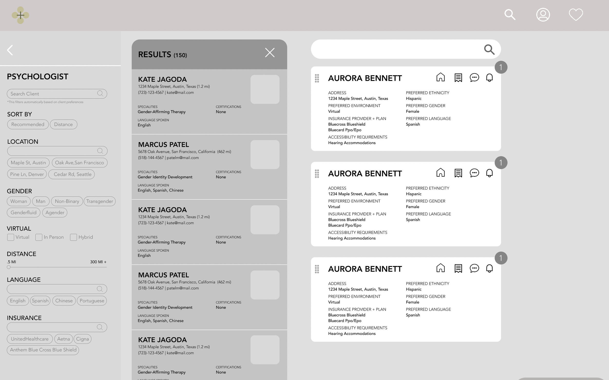
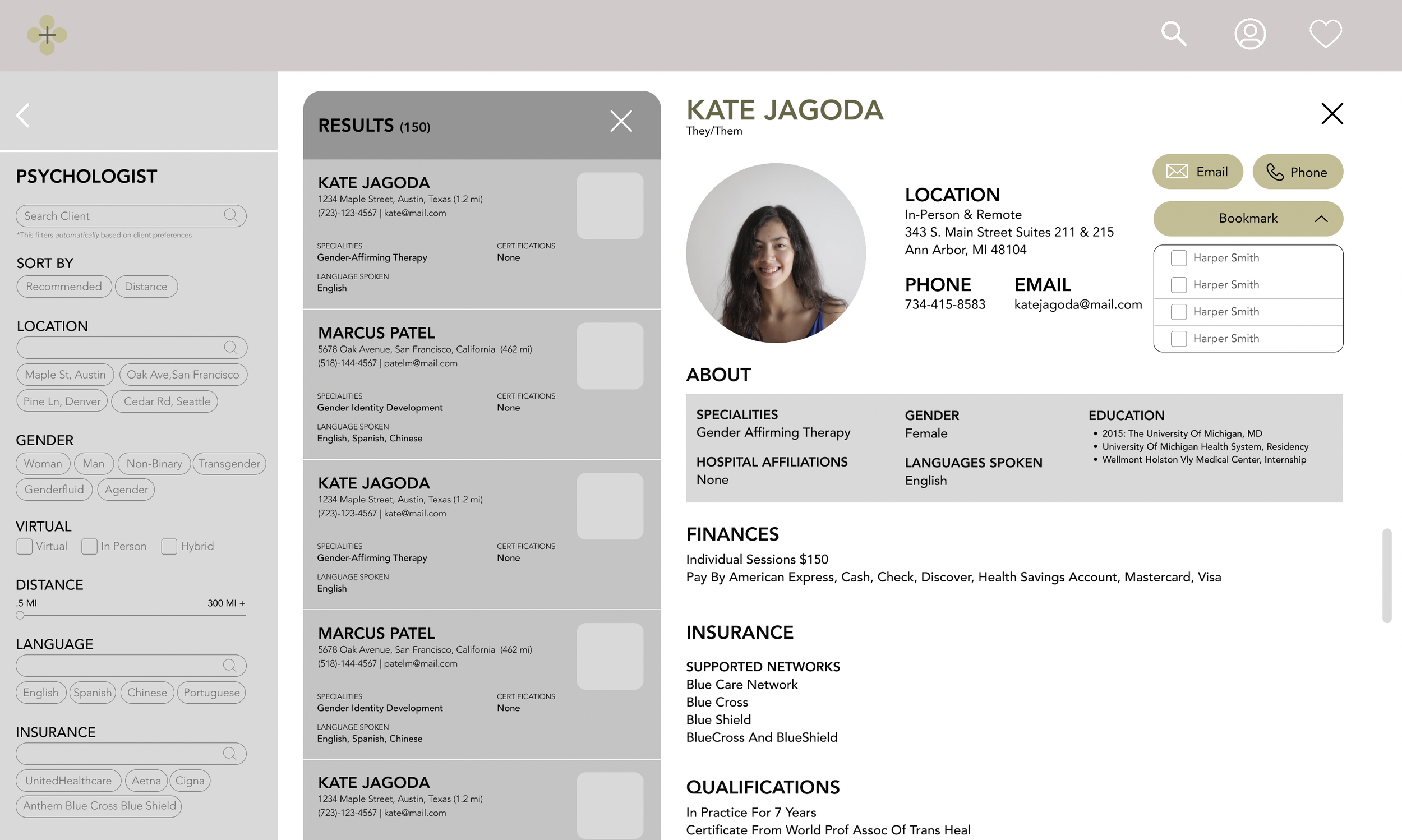
Search bar (users type in their searching criteria on insurance type/service type/doctor name and we give them ranked providers), Mark function, and Reviews.
What changes did we make?
Questions related to insurance could be added.
What did we conclude from our usability testing?
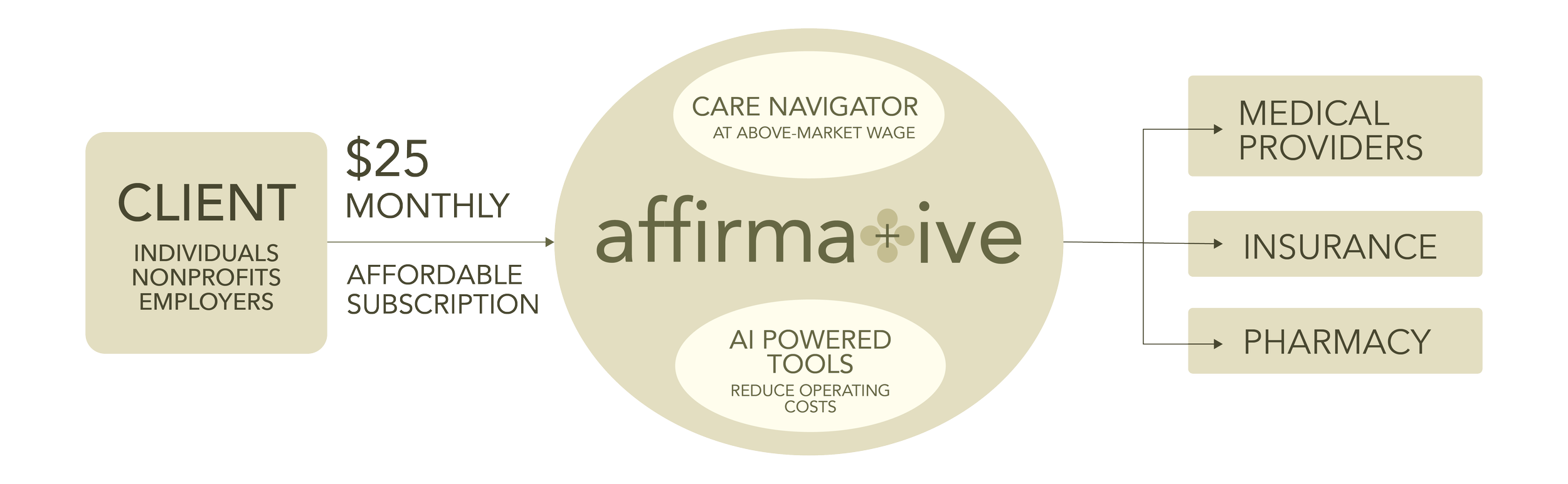
The users all have a generally positive attitude towards the product: one of them explicitly said he is willing to pay 30 dollars per month for this service.
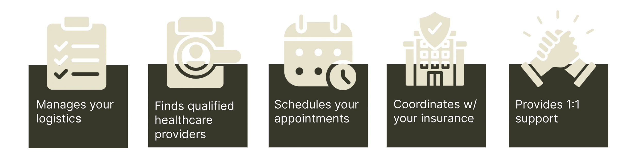
Our Product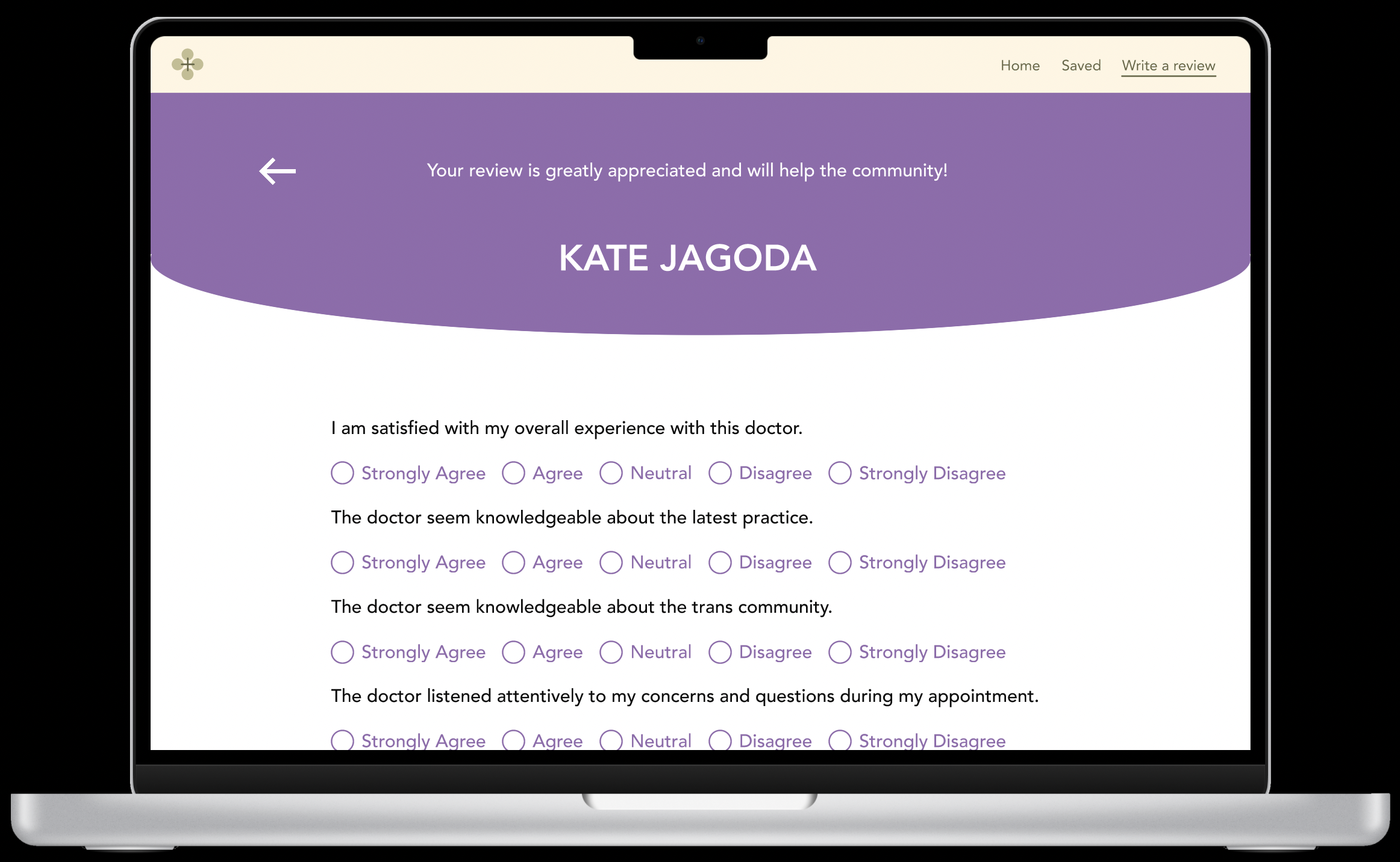
Community Backed Resources
Accessing Care Navigator
Patient-Centered Advocate
Help Navigating Insurance
Website and Database
Feedback-driven algorithmic search
Find Available Providers vetted by Community
Tailored Filters that are customized for the Trans Community
After 3 rounds of nerve wracking pitching…
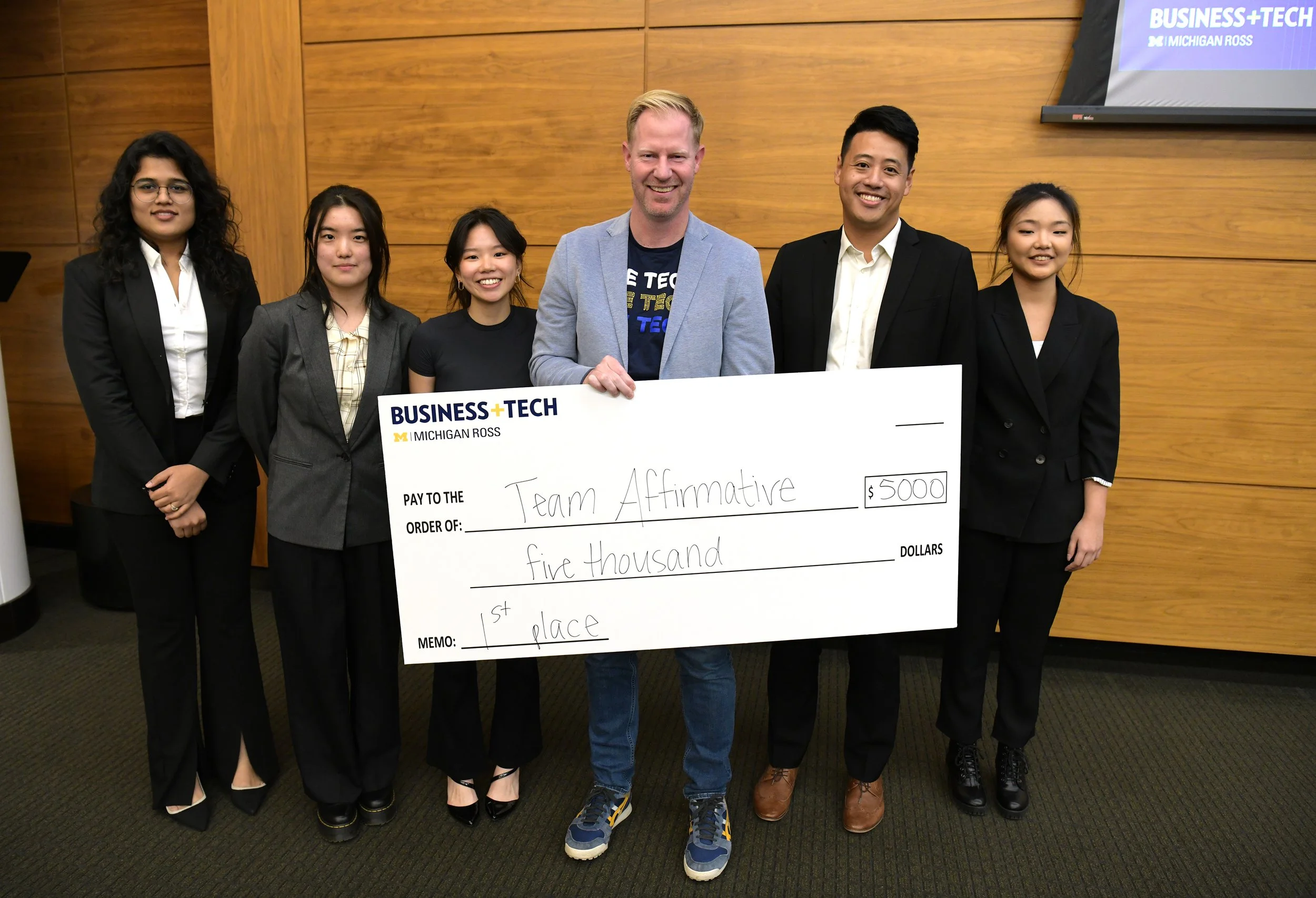
What we achieved
First place in Business+Tech Innovation Jam!
A minimum viable product
Feedback
We asked care navigators and the Trans Community: They like how information is condensed into one website and the specific filters we built out. They found the feedback form refreshing, and tailored to their experience. The judges liked the idea and would like to see the idea fleshed out more tech-wise.
This was what we envisioned.
Essentially, a system where we optimize care navigator workflow through search and in turn help the Trans Community. This looks good right?
Theoretically yes, but no.
I was confused about why can’t patients search for medical providers themselves. This model did not make sense to me.
Where does the care navigator come into play?
Back & Forth The team went back and forth about the users. We spent so much time researching care navigators, but now we are building something for the Trans community? To me, care navigators and the Trans community are two very different user groups.
I'm Confused???The miscommunications during meetings. I was confused about who we were building for. I thought it was the care navigators, but now it’s both patients and care navigators? Or is it just patients?
Failed to vocalized my opinionI vocalized my thoughts on how I thought this system didn’t make sense, but my thoughts on focusing solely on one user group did not align with the business goals at the time and I felt pressured by time and my inexperience, so I went with it.
I promise that I eventually spoke up for myself. PHASE 2
MICHIGAN BUSINESS CHALLENGE
~ less than 9 weeks
Focusing on one user and how do we help? AI powered search inquiry system designed for care navigators.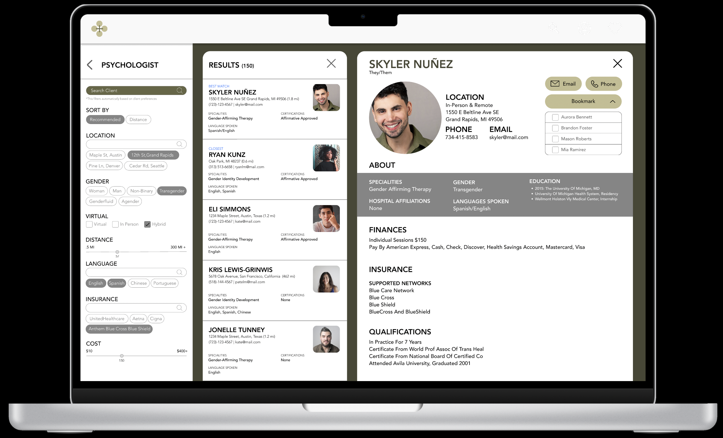
User confusion - Honing in our focus
I needed a clear answer, and after a long meeting with the team, asking questions about our target users and actively voicing my concern about the lack of focus on the target user, we are focusing on care navigators.
In the beginning, I told you that 85% of a care navigator’s time is spent researching medical providers and administrative tasks. We want to reduce the amount of time.
We had a rudimentary model of a work flow tool to reduce the amount of time, but for the interest of time and capacity of our engineering team,
we are focusing on optimizing the search
problem: How do we optimize care navigator search? What automatization can we employ to make their lives easier
Work flow
What does searching for medical provider currently look like for care navigator?
Searching online, scouring the internet to find a medical provider that matches the patient’s needs. This step takes the longest.
Find reviews of the medical provider to make sure that they are community-friendly
Looking at the insurance manual to find the approximate cost and coverage
Making appointments, including calling and emailing doctor’s office
Storing all this information, to be constantly updated and kept tracked.
What parts of the work flow can we improve?
Going back to the interviews and more research we have done:
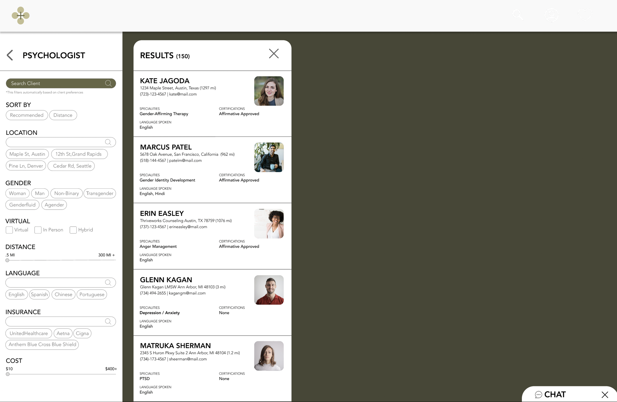
Search
What filters do we need to have tailored to the Trans Community?
Based on previous research and similar websites like ZocDoc, Psychology Today: location/gender/virtual/distance/language/Insurance
Creating a sort-by system based on AI recommendations.
Insurance
How do we parse through insurance?
Hypothesis: AI-powered technology
Saving the information
Having one place to save all the information.
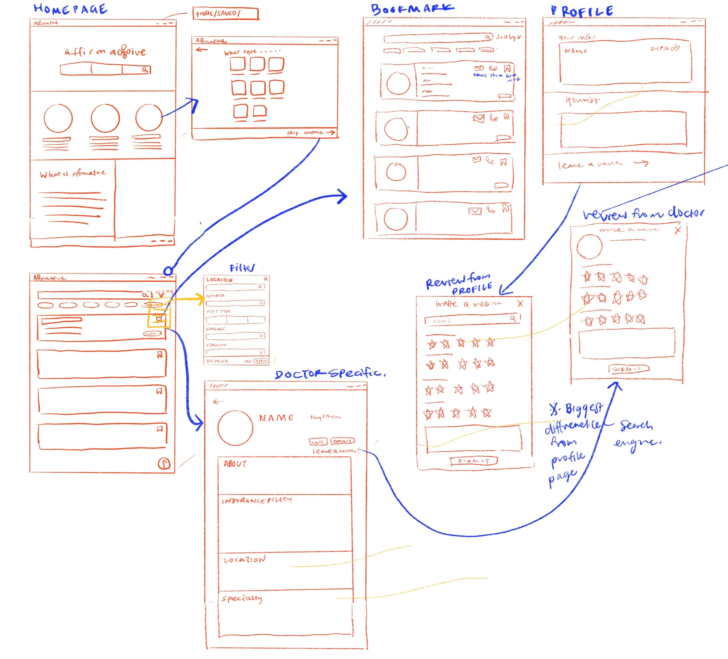
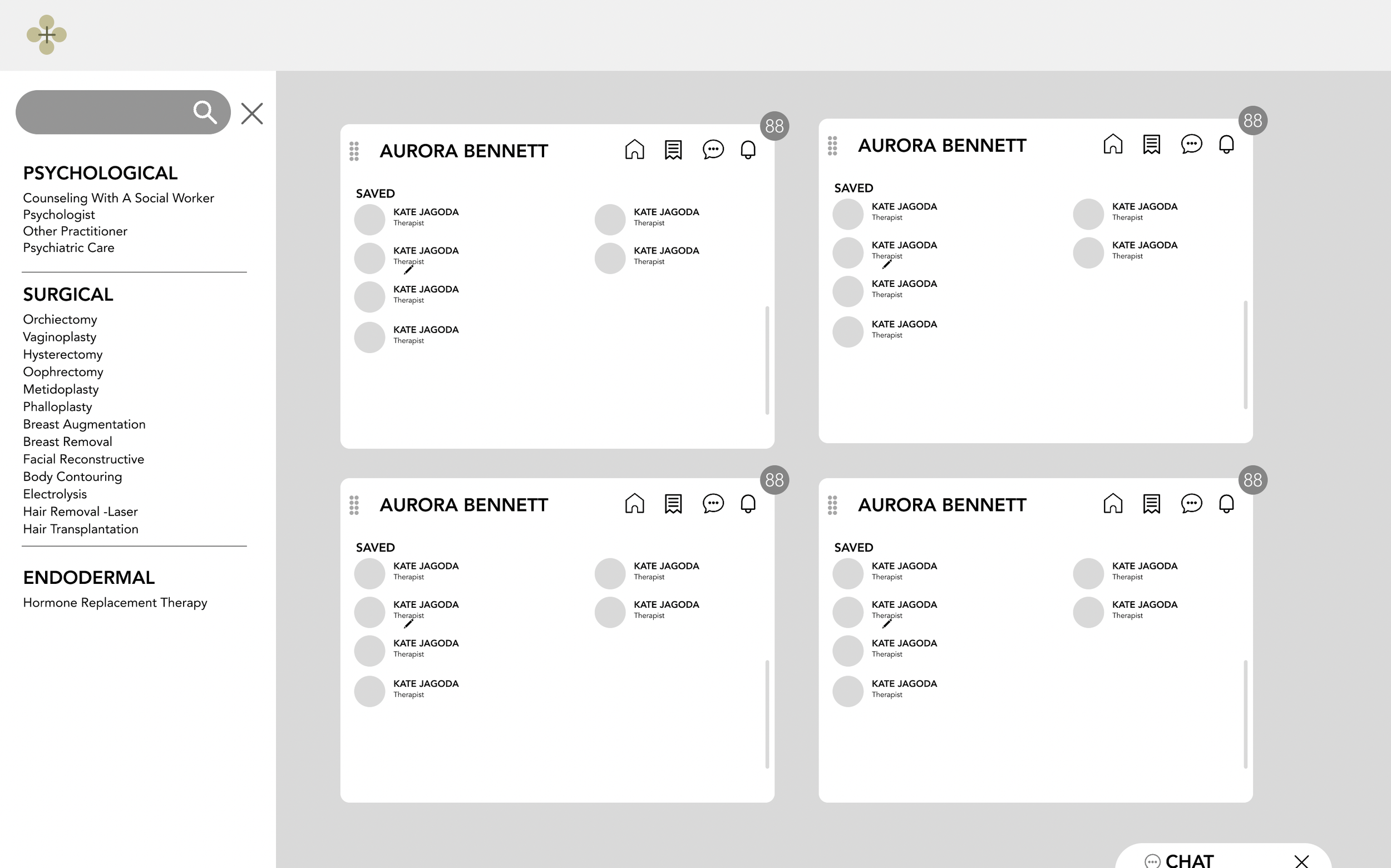
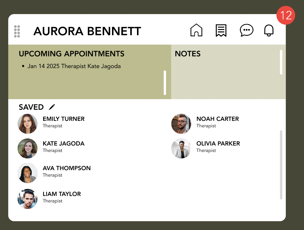
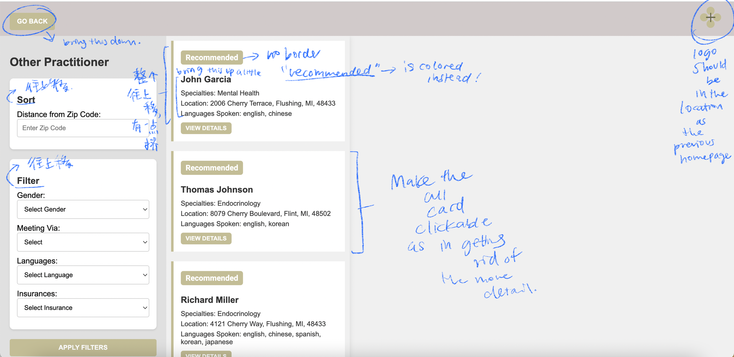
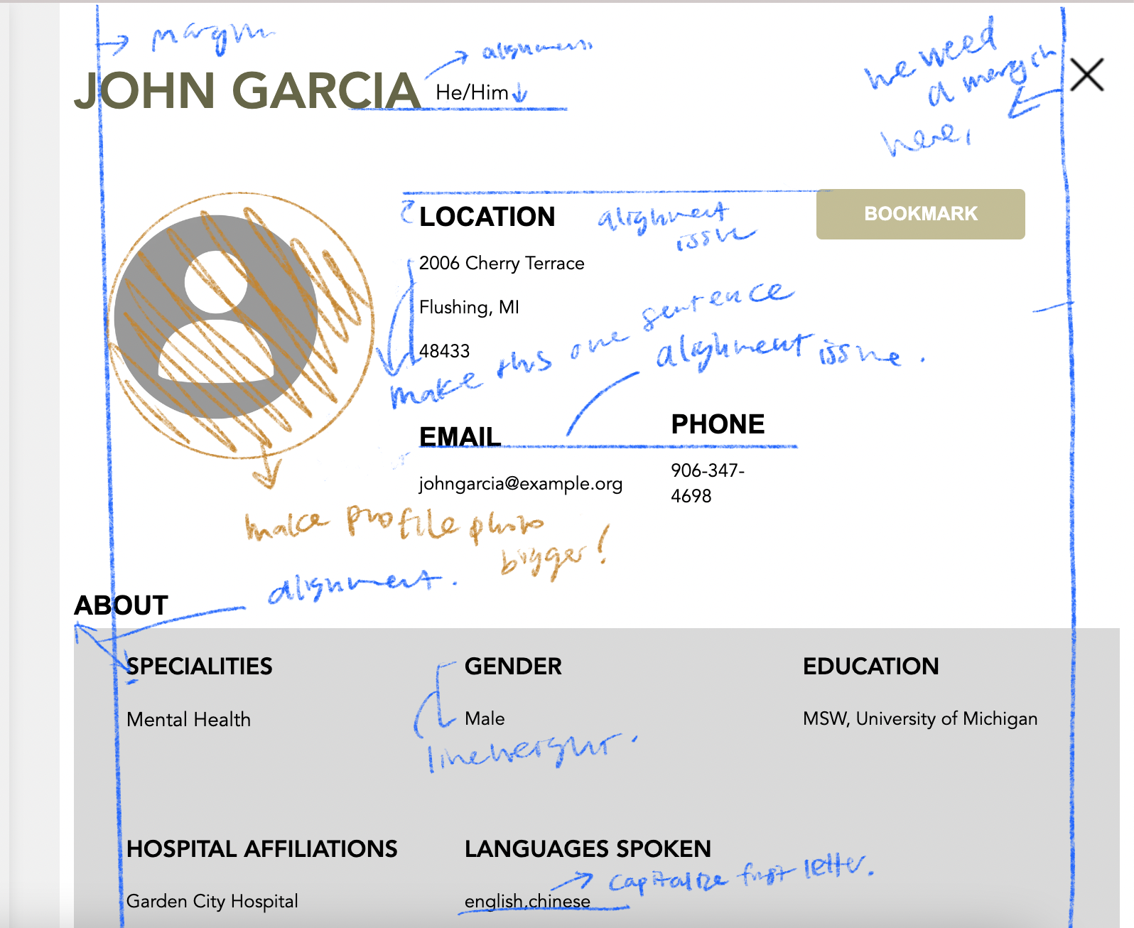
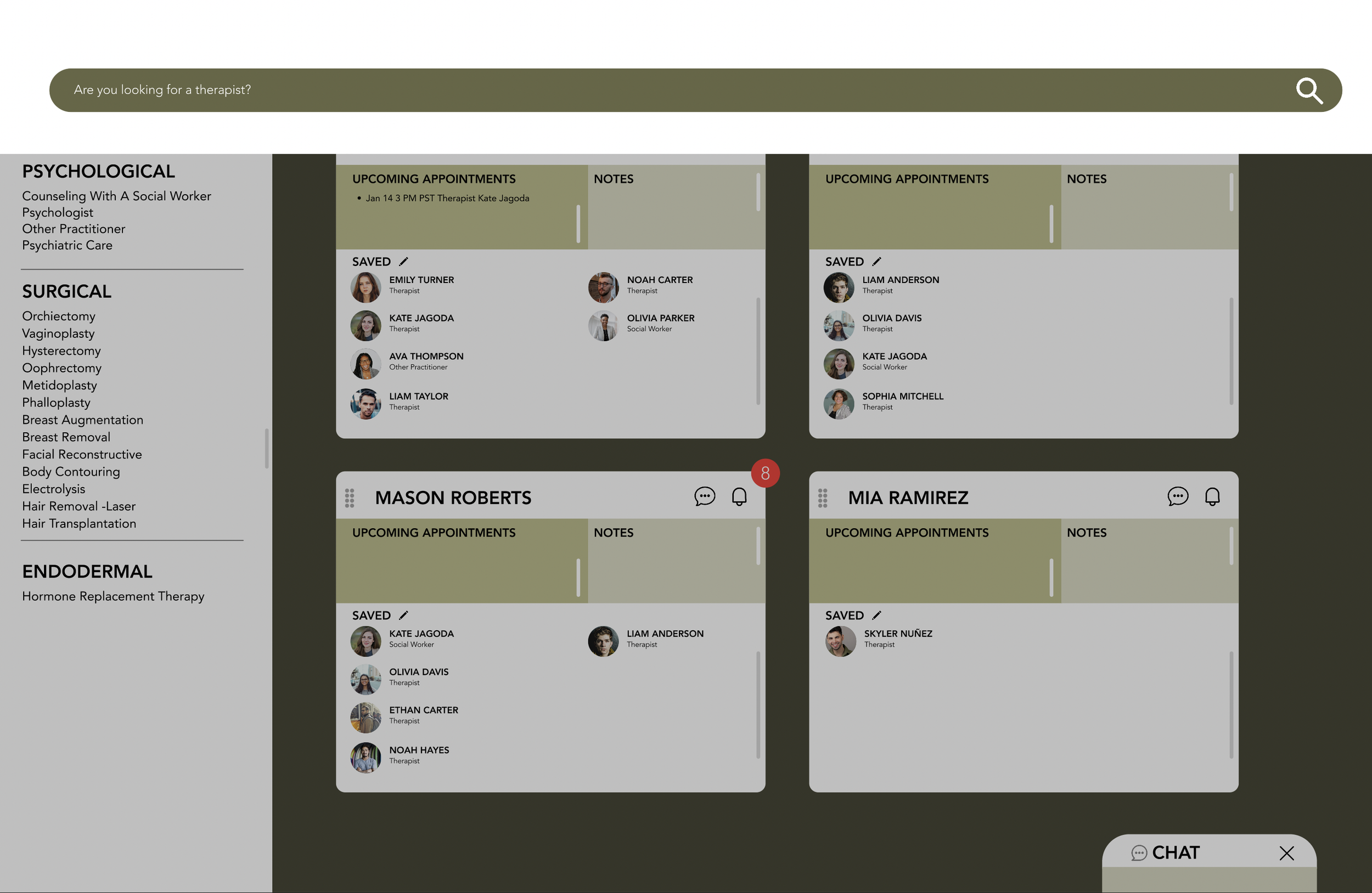
Initial Wireframes
Excuse my very messy wireframes, but essentially, this was the base model. I wanted everything to be on one page. While drafting, I asked developers and product managers questions to see if our visions aligned. They had one key feedback: It’s good for the future, but it’s too complicated to build it all in time.
From the questions I placed, we discussed what we believed would work and I turned it into a more concise wireframe on the right.
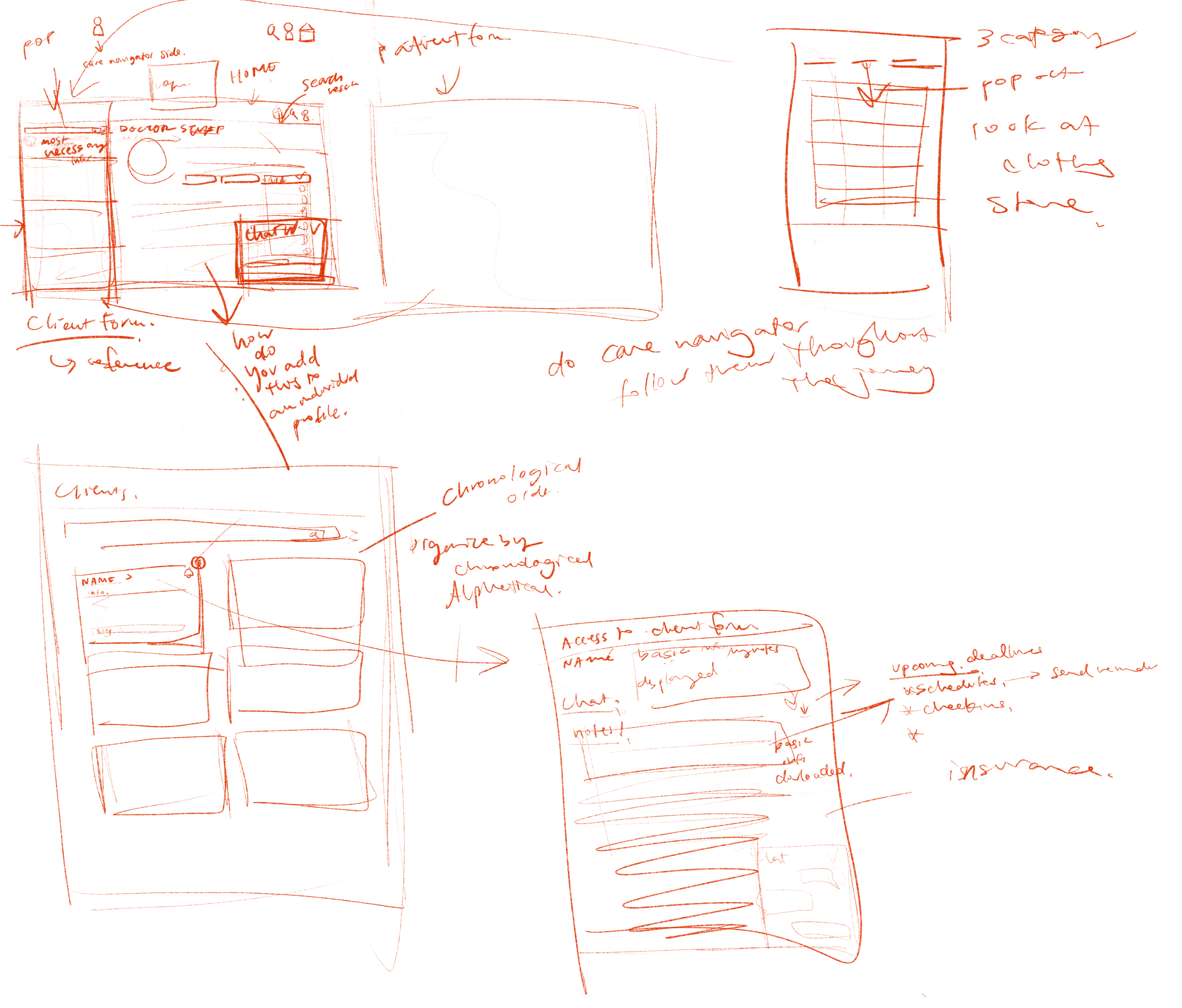
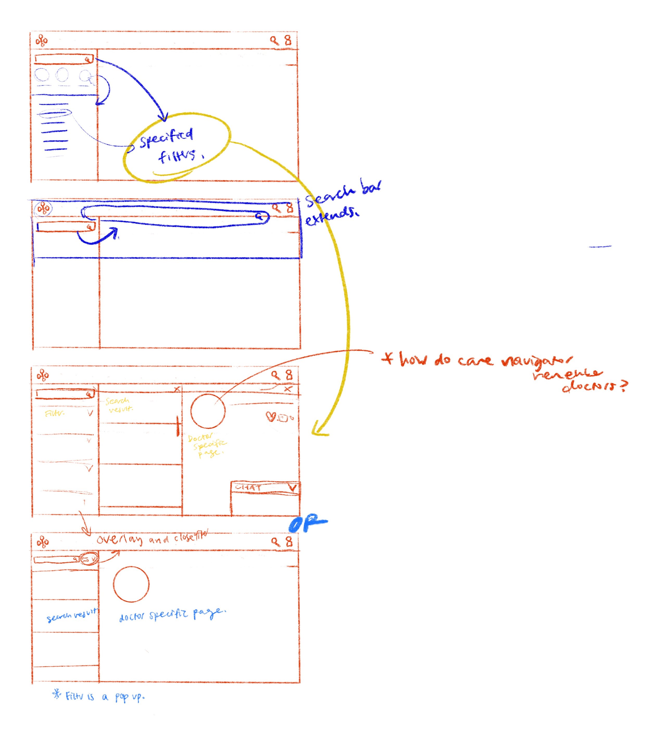
How is this different from other platforms that offer provider search?
Making everything movable. The cards and tabs are customized to each care navigator’s liking.
Moving to more Wireframes
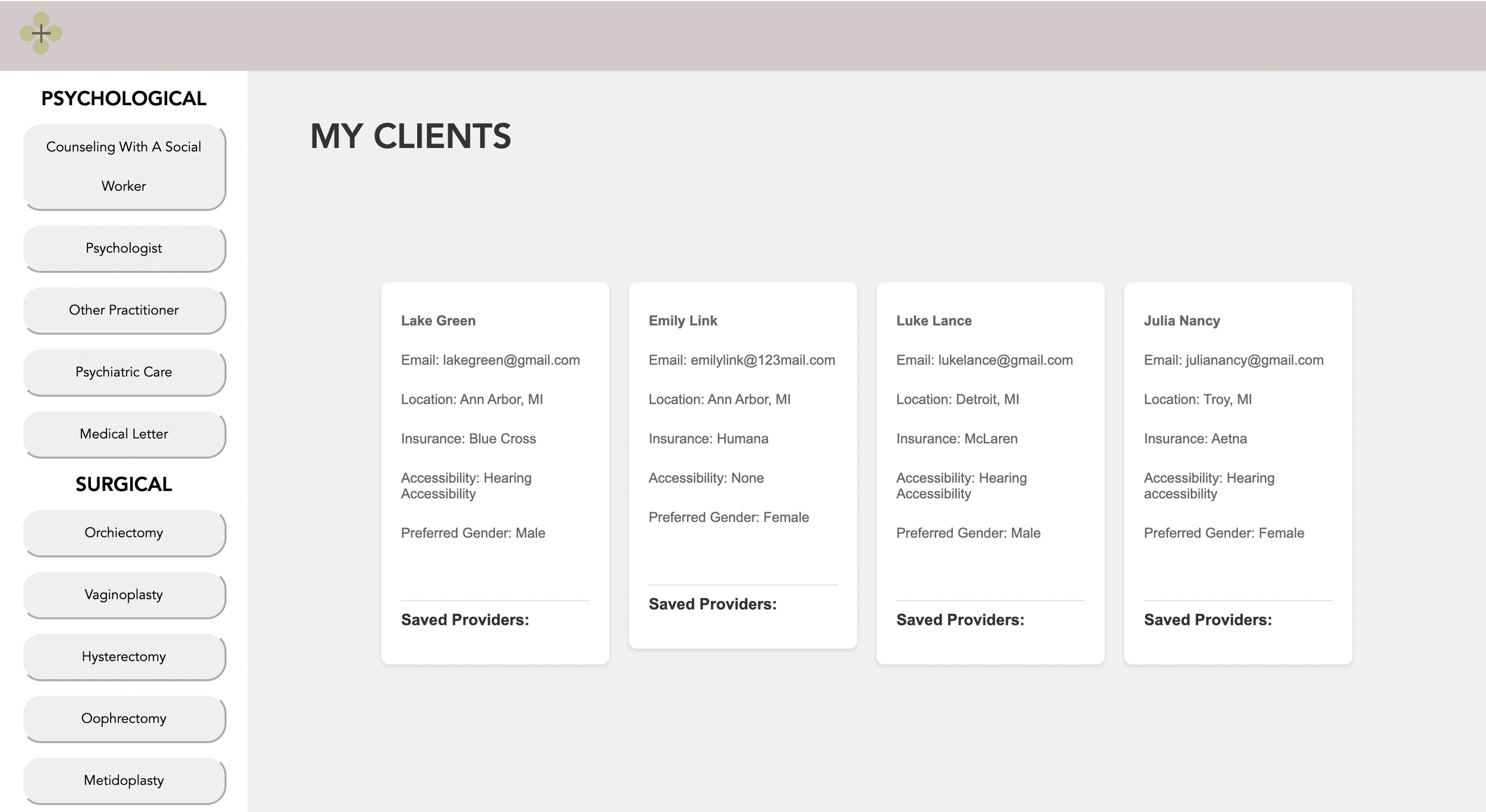
Cards for individual patients
Helping care navigator recall previous information, saved medical provider
Search function readily available
Individual Patients Cards
Helping care navigators recall preferences
Filters based on research
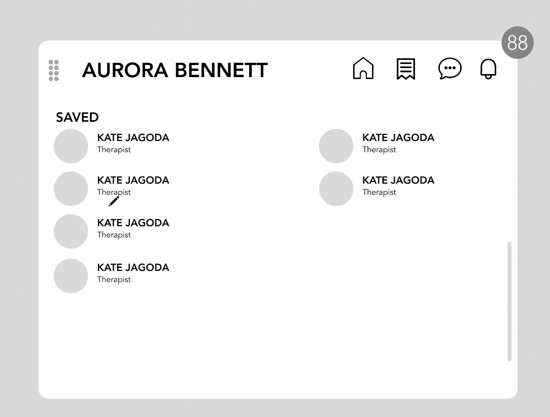
Bookmark
Saving medical provider to the patient as care navigator sees fit.
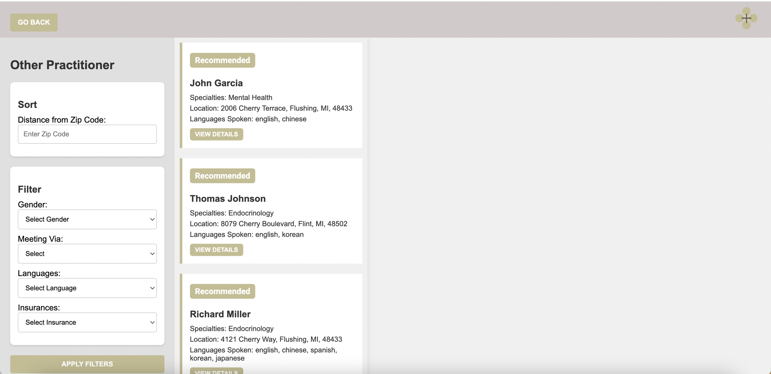
Medical Provider Cards
Showing the high-level information, so care navigators don’t have to go through individual medical providers.
Modifications
Utilizing Space
Google Maps: Utilizing a collapsible side menu to maximize space utilized
GroupMe: Movable chat boxes, that allow multiple chats at once. Also, has a collapsible side menu.

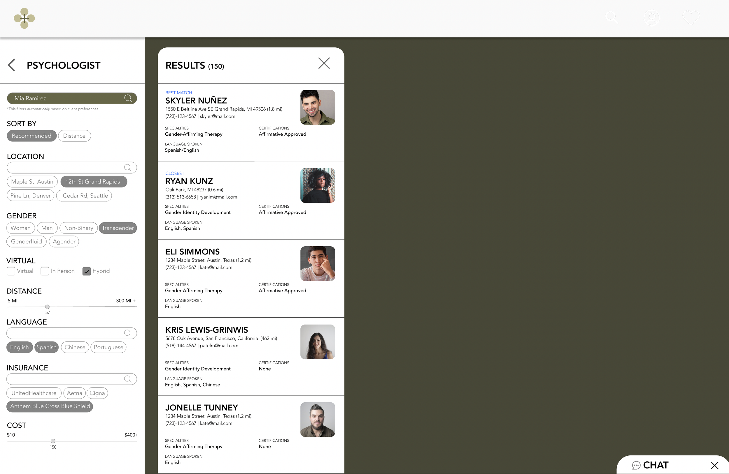
AI showing the best available options
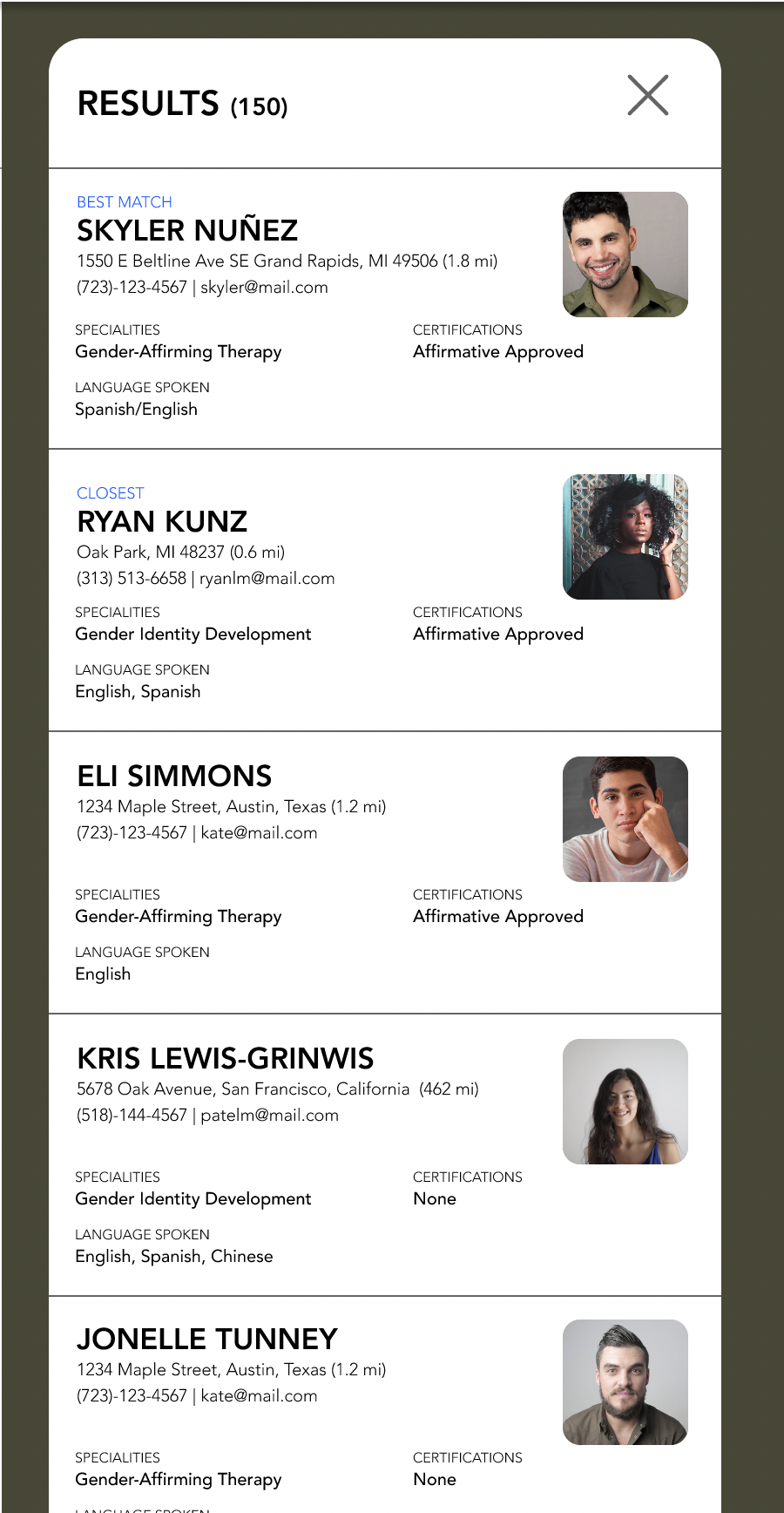
Indicating on the top a title such as the best match, and closest, so that the care navigator can discern the best option for the patient easily
Adding more functionalities
Allowing care navigators to take notes and remind them of scheduled appointments so they don’t have to remember.
Implementation and Setbacks
After the modifications, I showed the developers the wireframe, and immediately there were pushbacks..
The functionalities such as the chat, notification, and taking functions I wanted to build are too complicated to be completed within the timeline
After a long discussion with the product manager and developers, we decided to implement the most important feature, the search.
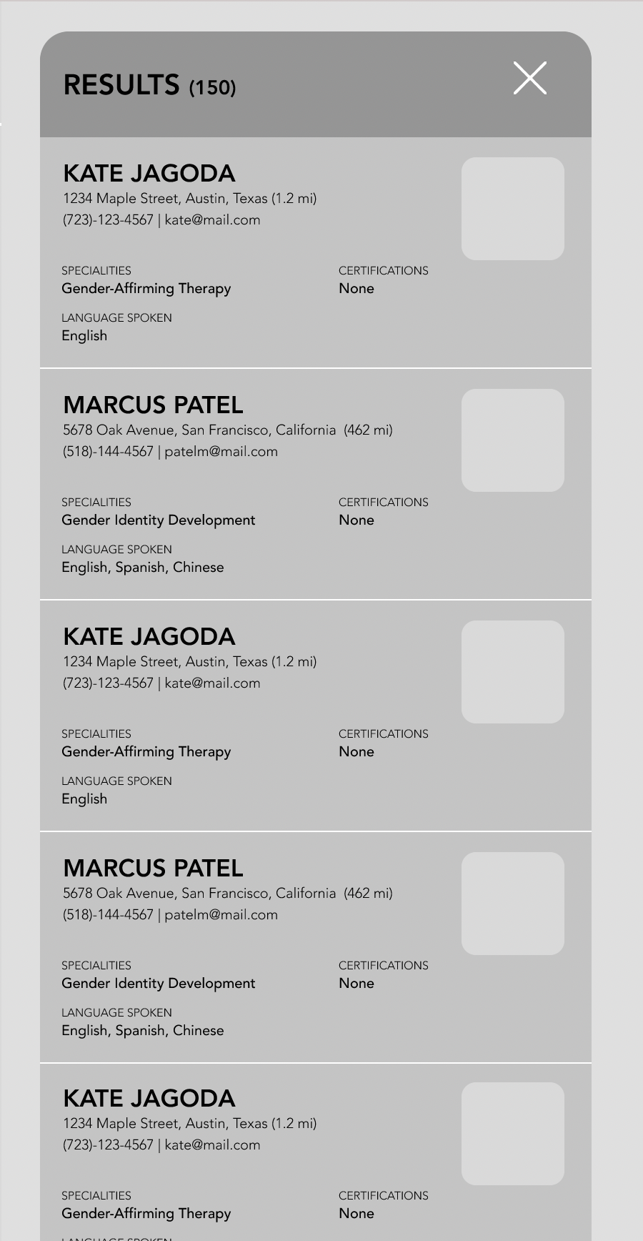
I was surprised to see the base model created by the developers—it was different compared to my wireframes!
This is what they showed me:
The developers did not understand my reaction to the model because it worked and functioned perfectly.
They added and deleted elements that I believe were crucial to the wireframe and the aesthetic usability of the model.
And this was my wireframe:
Needless to say, it was different. I wanted to grasp the underlying reasons behind the differences.
I took the opportunity to explain to them the importance of efficient use of space in user interfaces. I explained to them that the buttons that they added were not an efficient use of space as now care navigators need to scroll to find all the available options.
Despite initial hesitation, I persisted in showing them examples from popular websites like Nike, demonstrating that clear, concise design can enhance user experience. Eventually, they had a breakthrough and realized that the buttons were unnecessary.

Trust develops
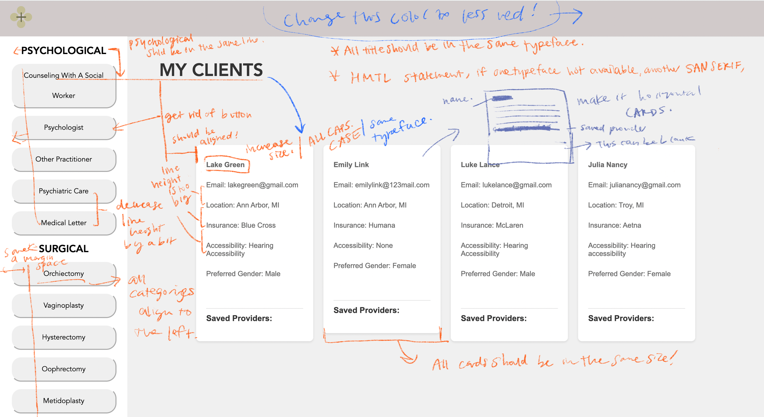
The developers started to trust my designs more. I gave them feedback on the current design.
Pointing out margins, alignment, standardizing sizing, and placement problems.
When we tested out the model on a Windows system, we noticed differences so I asked them to add alt fonts.
Meeting together and fixing the front end!
Eventually, through multiple late nights at the library furiously coding and searching on Stackoverflow, we had a final model to present at the Michigan Business Challenge.
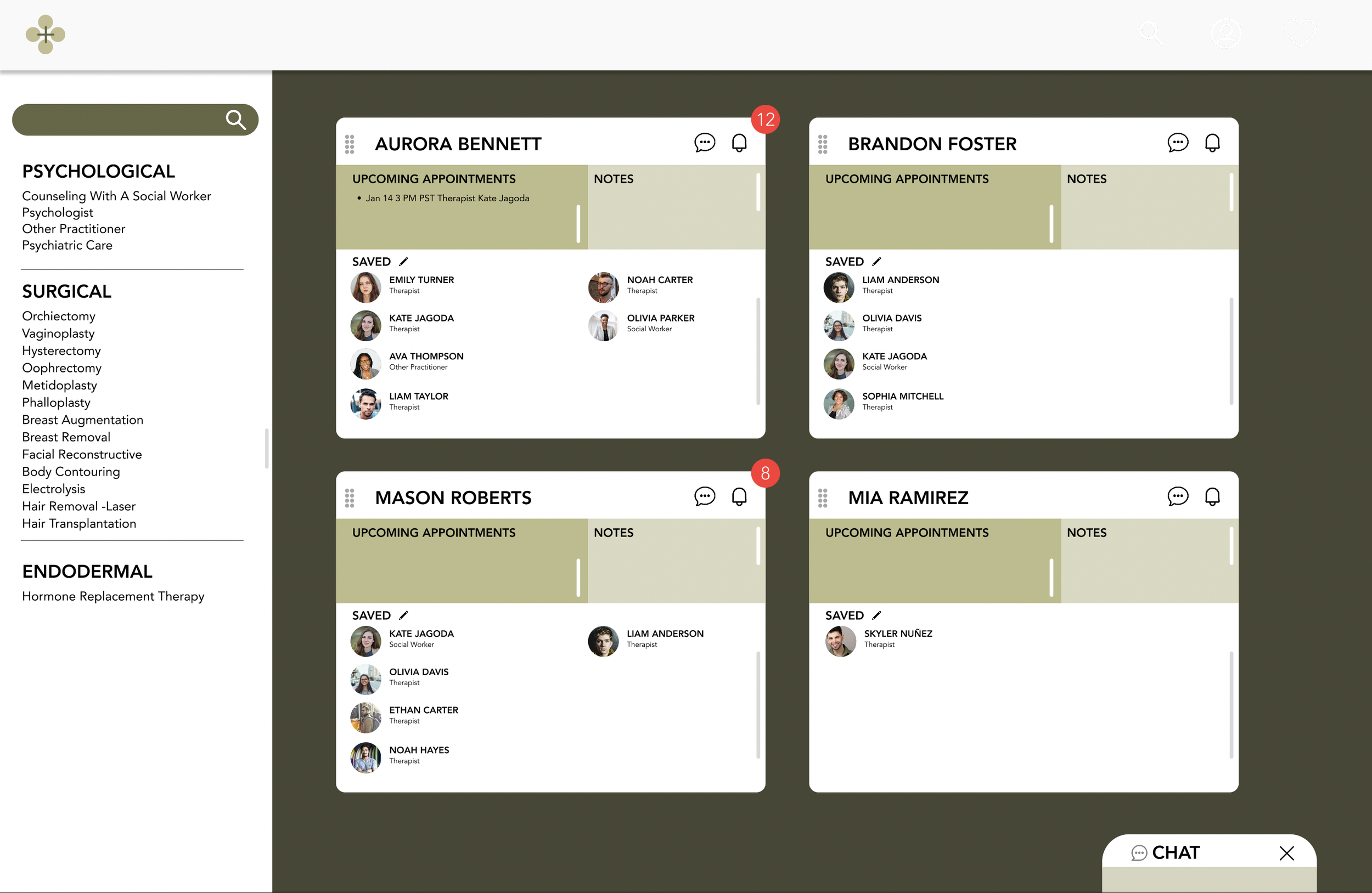
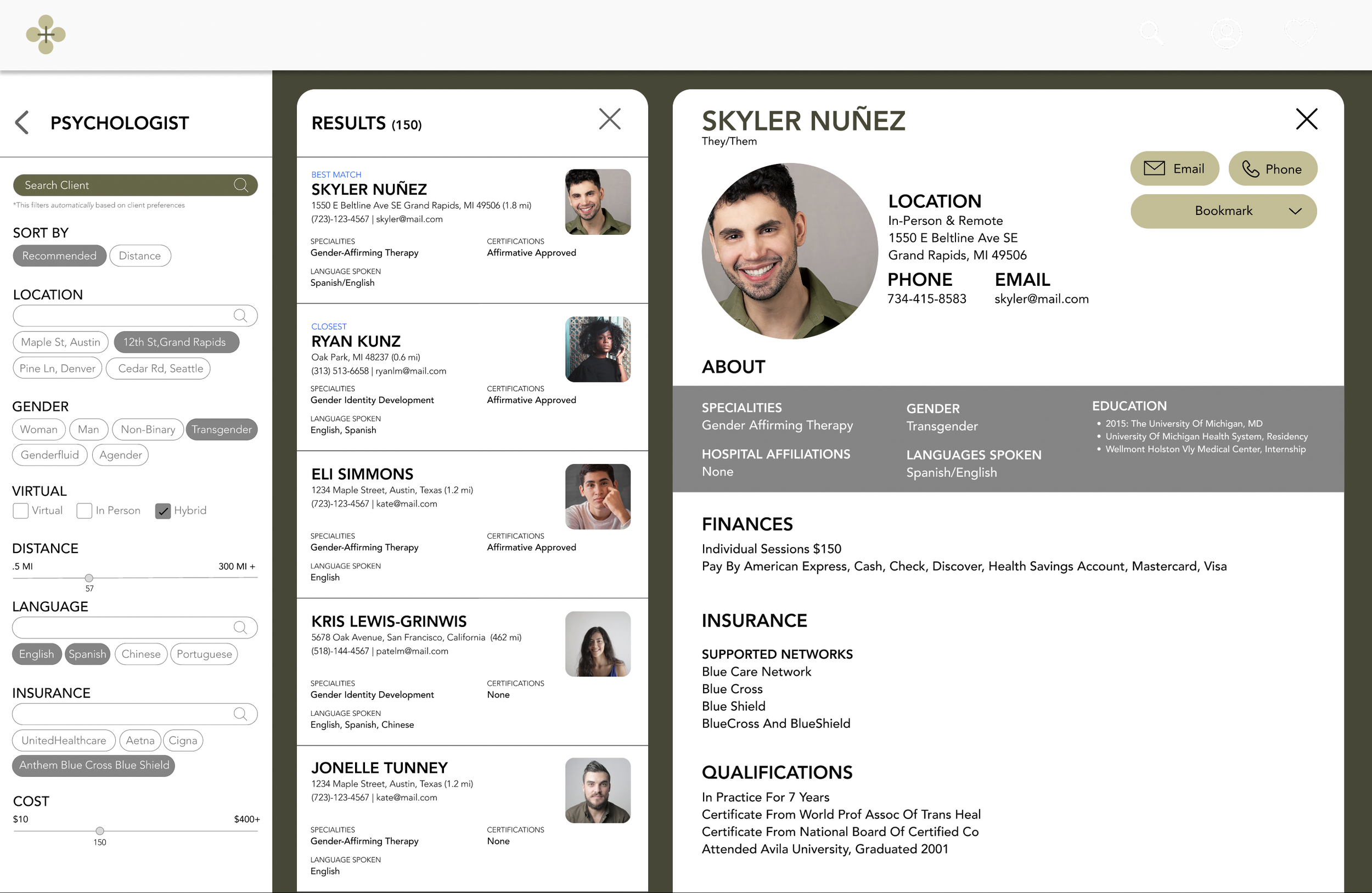
See it for yourself
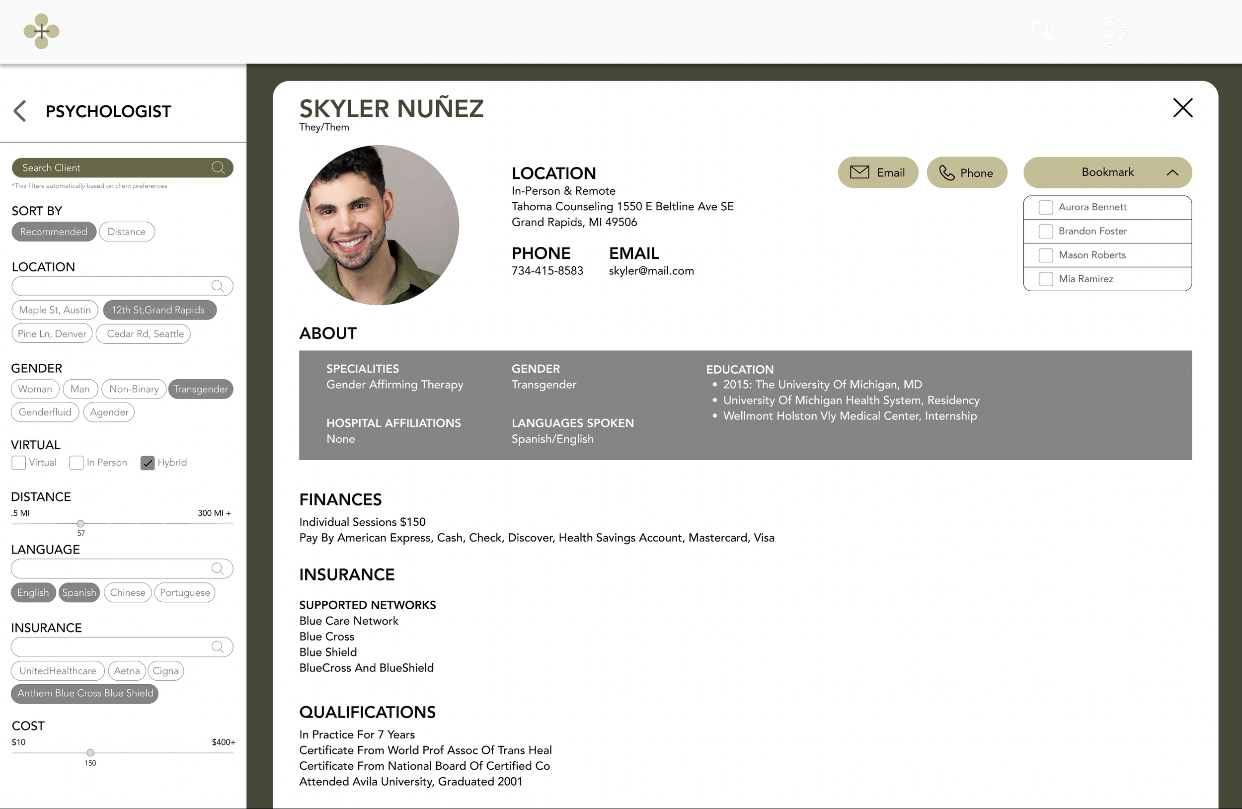
The Figma prototype has more functionalities, however the main function of search is the same.
The care navigator can now search for patients directly and filters based on patient preferences would be automatically applied.
AI would then pick the top medical provider based on different categories such as best match, closest, etc.
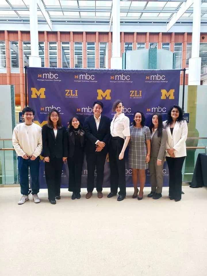
With all the late night prepping, I was feeling much more confident than last time. We went through 5 rounds of pitching, eventually there were 5 teams in the finals.Presenting at the Finals at Michigan Business Challenge,
WE WON!
I was so nervous the entire time
I spent a lot of my time working on the deck with the business team.
I demoed what the product team had created by showing a side-by-side comparison of our platform doing the same tasks a fifth of the time.
The panel judges were impressed and had concerns about the marketing strategy and how AI would be implemented. These concerns were answered by phase 3.
Community feedback was great, evidenced by the signup rate for the care navigation pilot program.
What I learned from phase 2
Don’t be scared to voice your opinion. Especially, when communicating ideas, back them up with design principles and examples that make it easy for everyone to understand your rationale.
Research about competitors that will help you make design decisions and learn from them.
Talk in each other’s language. Learning about the different languages that everyone on the team speaks helps communication. For instance, transferring specific terminology like kerning, margins in graphic design into something easier to understand.
Think about implementation when designing. Talk to the product manager about aligning with the business goals to stay on track.