
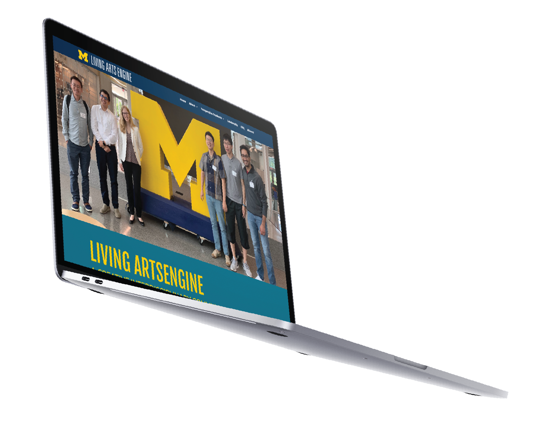
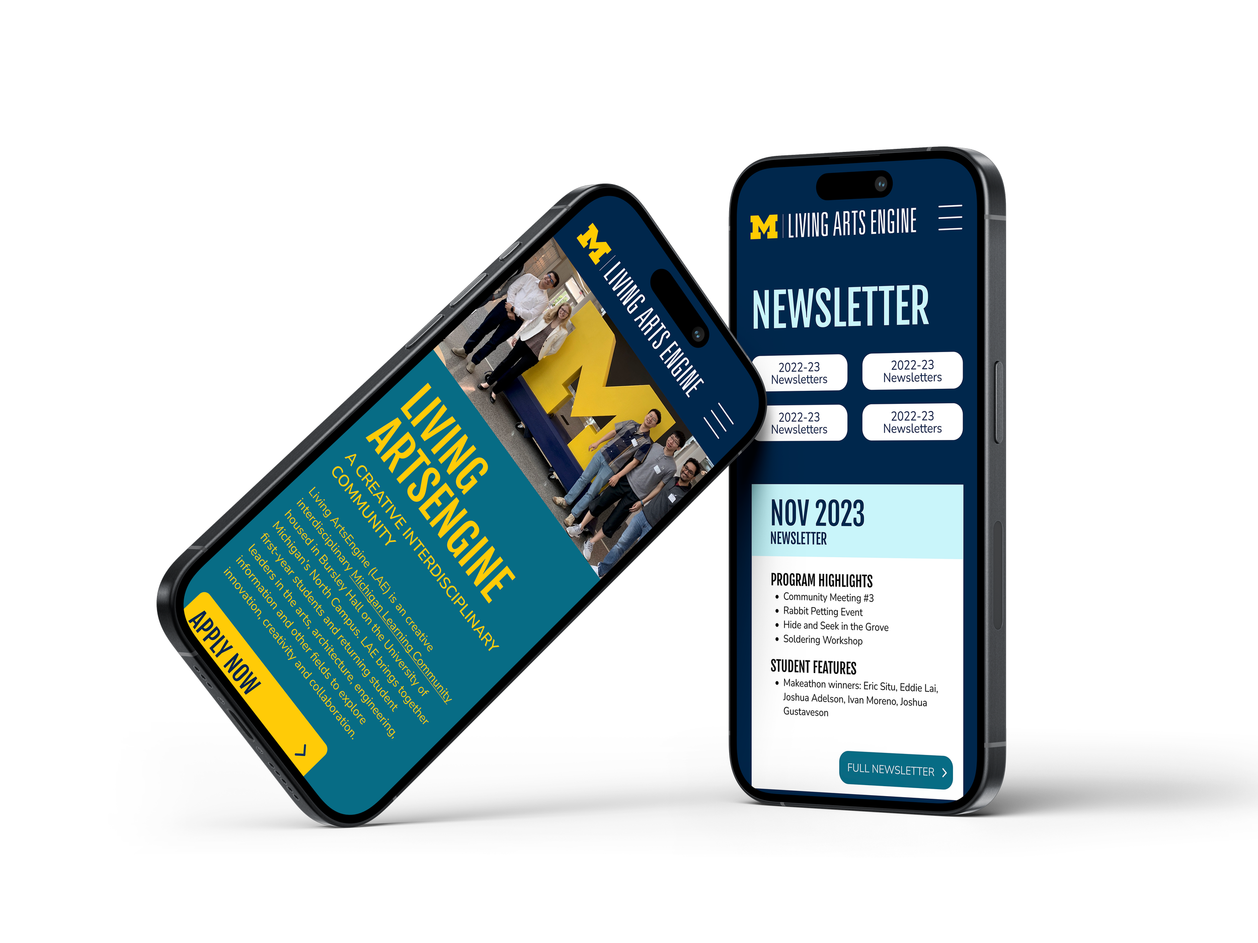
Living ArtsEngine
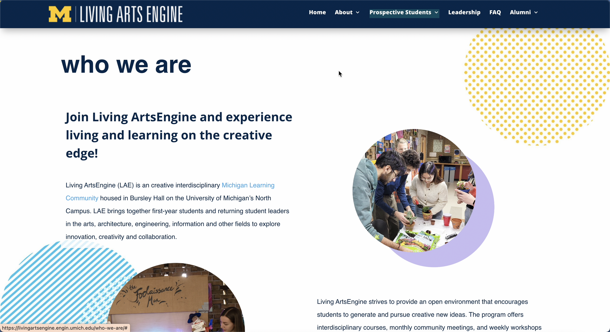
UX DesignerLiving ArtsEngine (LAE) is a creative interdisciplinary Michigan Learning Community↗ housed in Bursley Hall on the University of Michigan’s North Campus. LAE brings together first-year students and returning student leaders to explore innovation, creativity, and collaboration.
*we are currently actively working on the mobile and website
TEAM: Rachel Oti -PM | Jiazi Chen - Engineer
DURATION: Nov 2023 - Current
TOOLS: Figma, Jira, Illustrator
GOALS:
Visual: Revamping the visuals of the Living ArtsEngine website involving both aesthetic and functional considerations.
Information: Reorganize information to make it more digestible and easily reachable. Group related content together to create a logical flow.
Target Audience: To attract U of M undergraduate students to apply to the Living ArtsEngine Program.
The redesign impact
Users increased by 83.4%
Engaged sessions increased by 79%
Events per session increased by 49.2%
Views increased by 72.4%
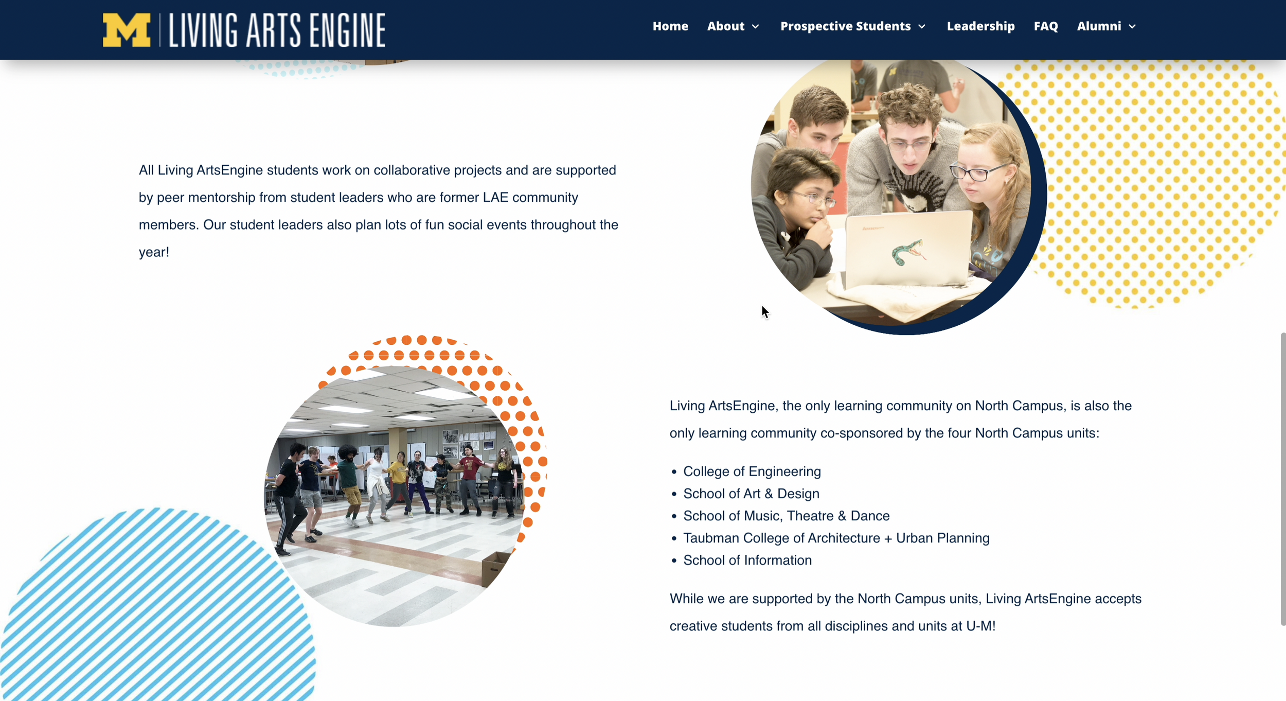
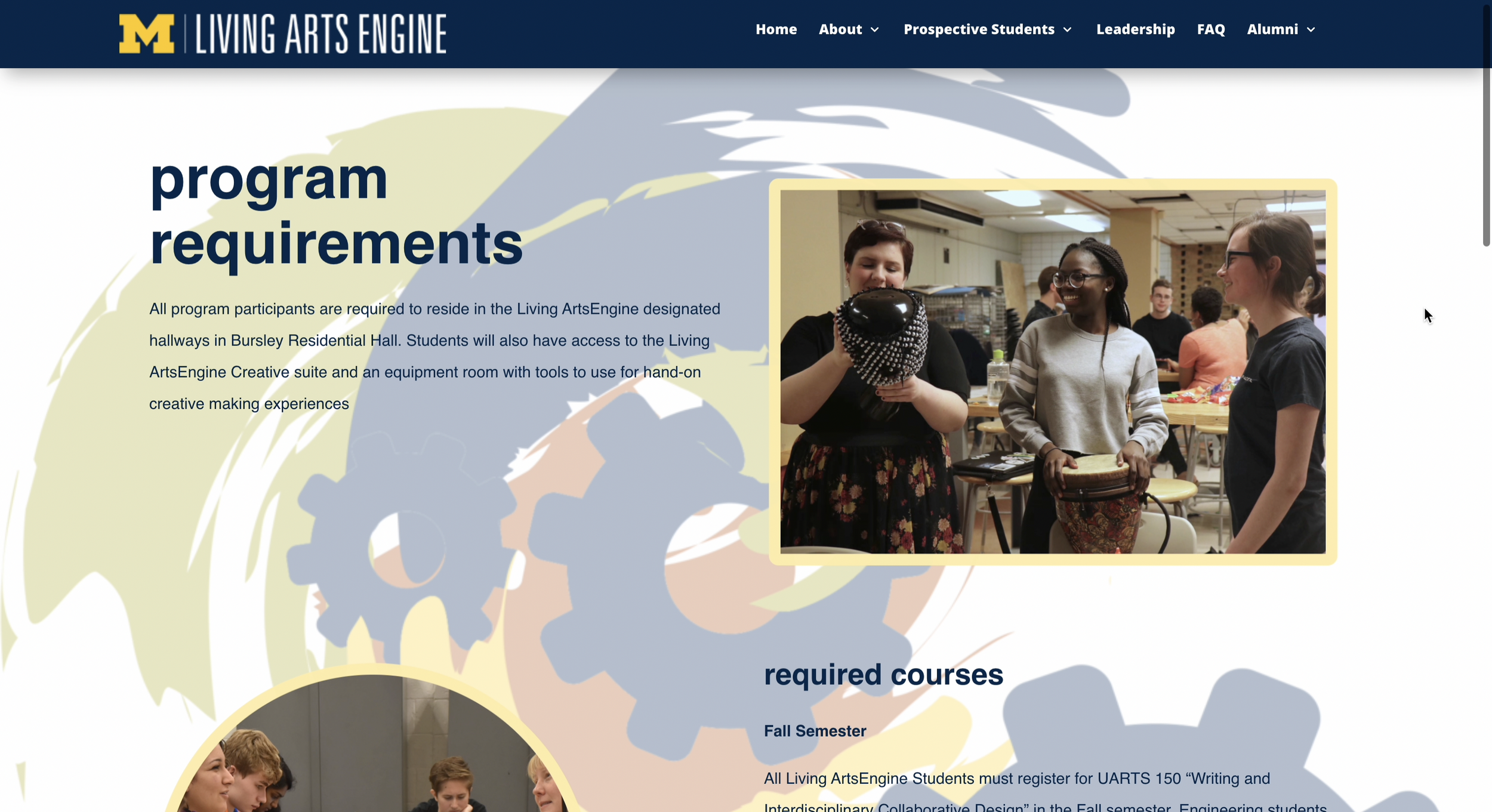
The Visuals were not visualling..The website’s look was outdated, not in alignment with the branding, and information was presented inefficiently.
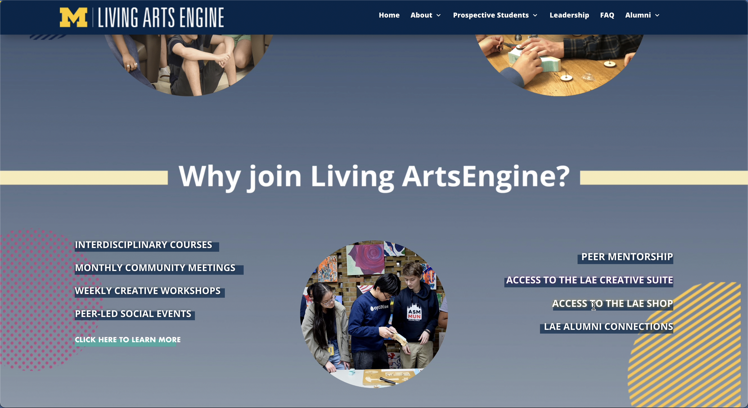
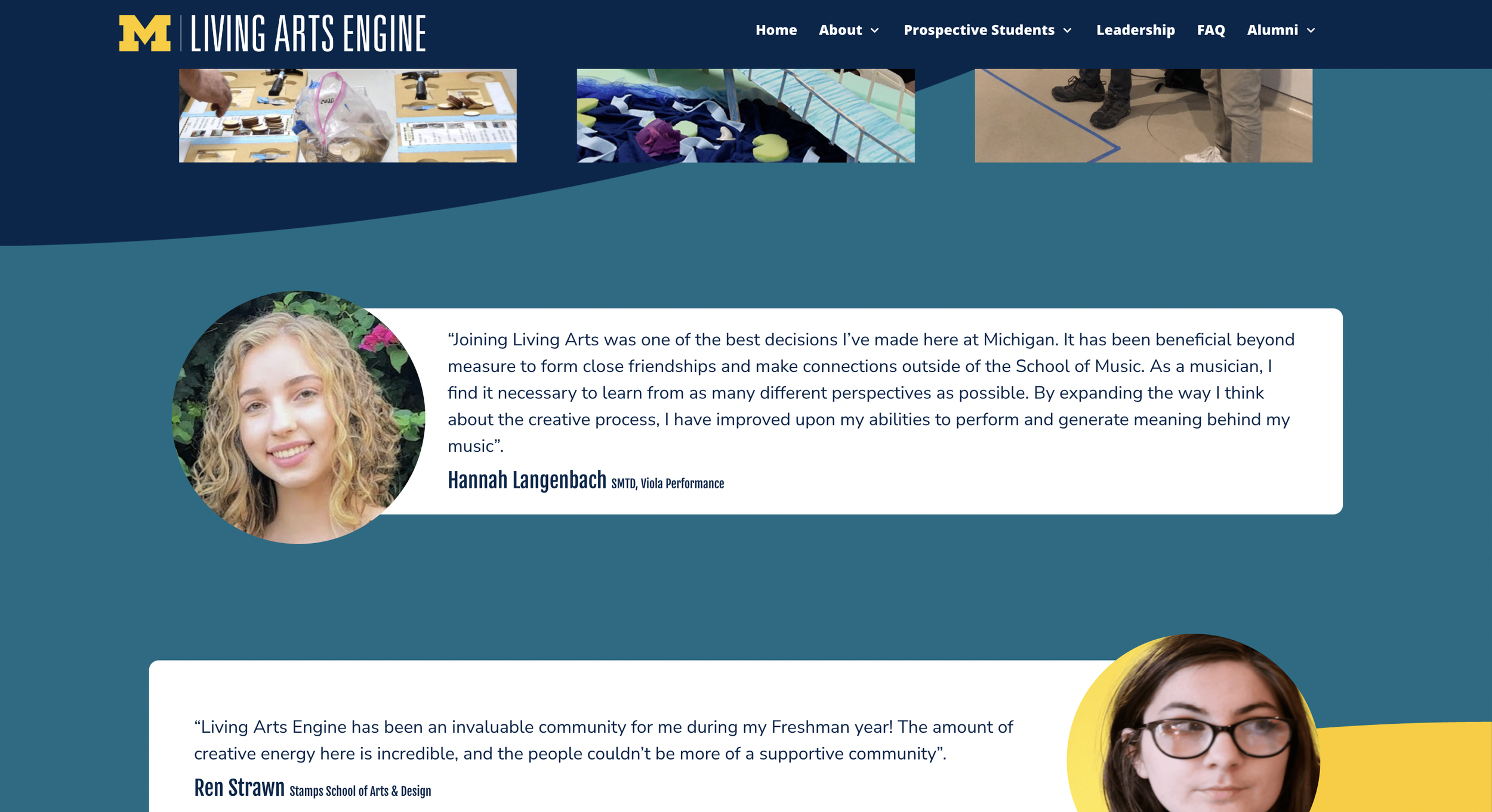
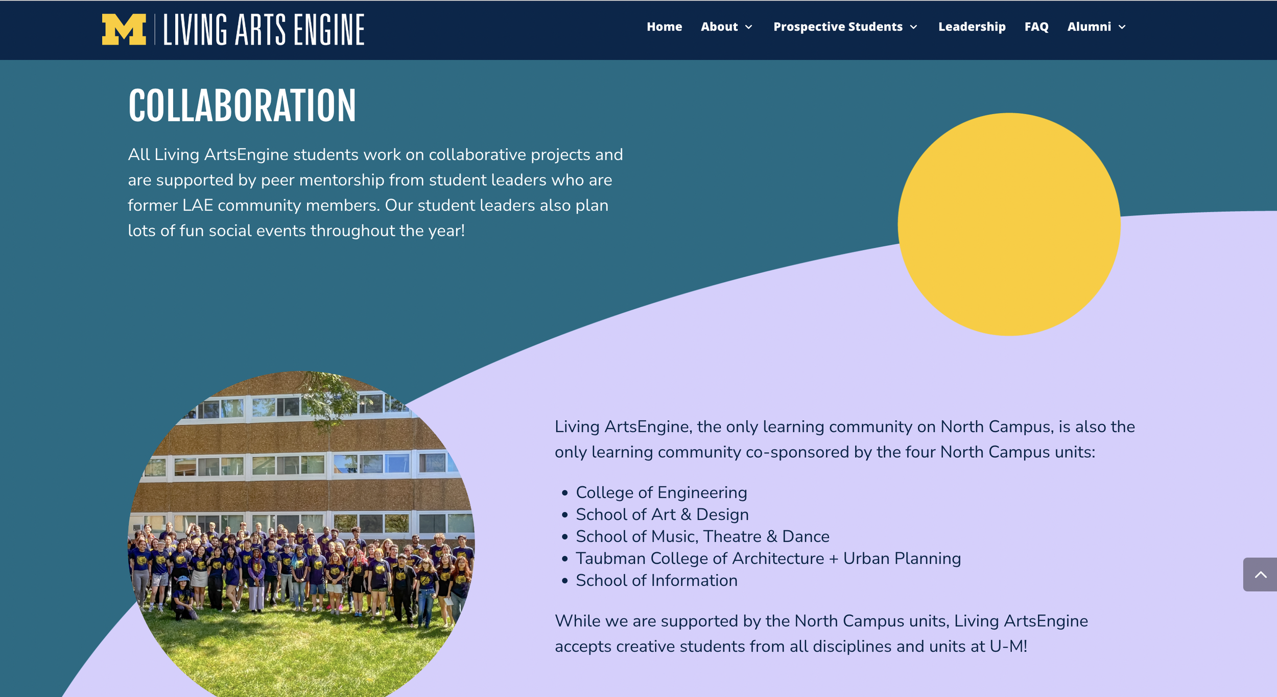
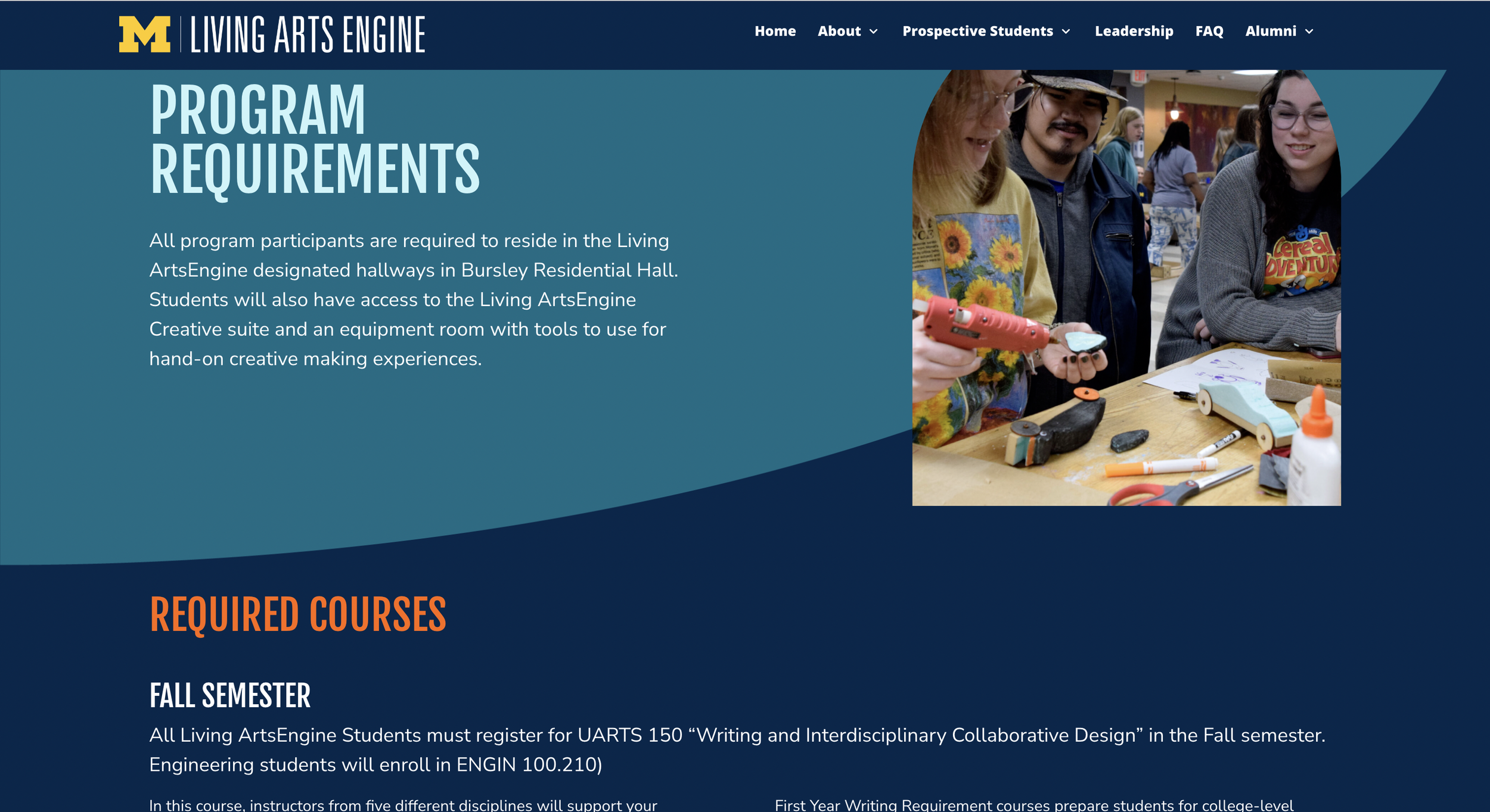
Colors and shapes
LivingArtsEngine is going to through a rebrand. Rachel (PM) mentioned that
They want more dome/circle solid-colored shapes
COLORS, COLORS, COLORS!
A new color scheme needs to be incorporated
Following the University of Michigan design guidelines
To address this,
I brought in
Large color blocks as background
Incorporating circles and dome shapes as photo designs
Following U of M design guidelines and using Inter and Nunito Sans as typeface
Chunking Text
Following Miller’s law, breaking down information into bite-size pieces to help users process and understand information
Creating standards for text sizes to create visual hierarchy
Visual Hierarchy
Fixing Inconsistency
There were a lot of different colors, cover graphic styles, and text, overall a lot of different things going on.
To update it, I wanted to keep the colors, streamline the graphics for easy editibility, chunk information for easy readability, and large call-to-action buttons.

The Before and After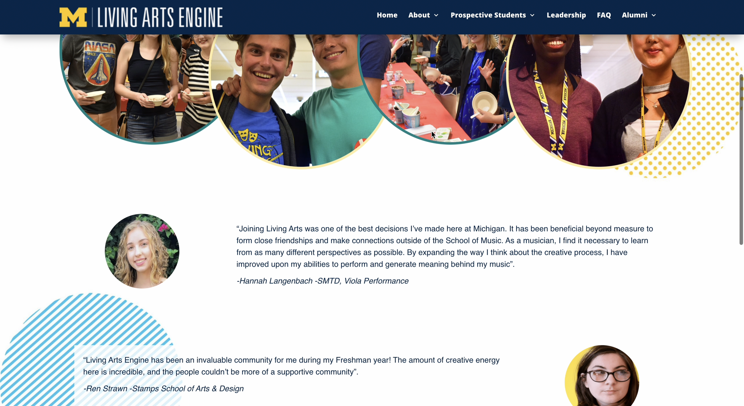
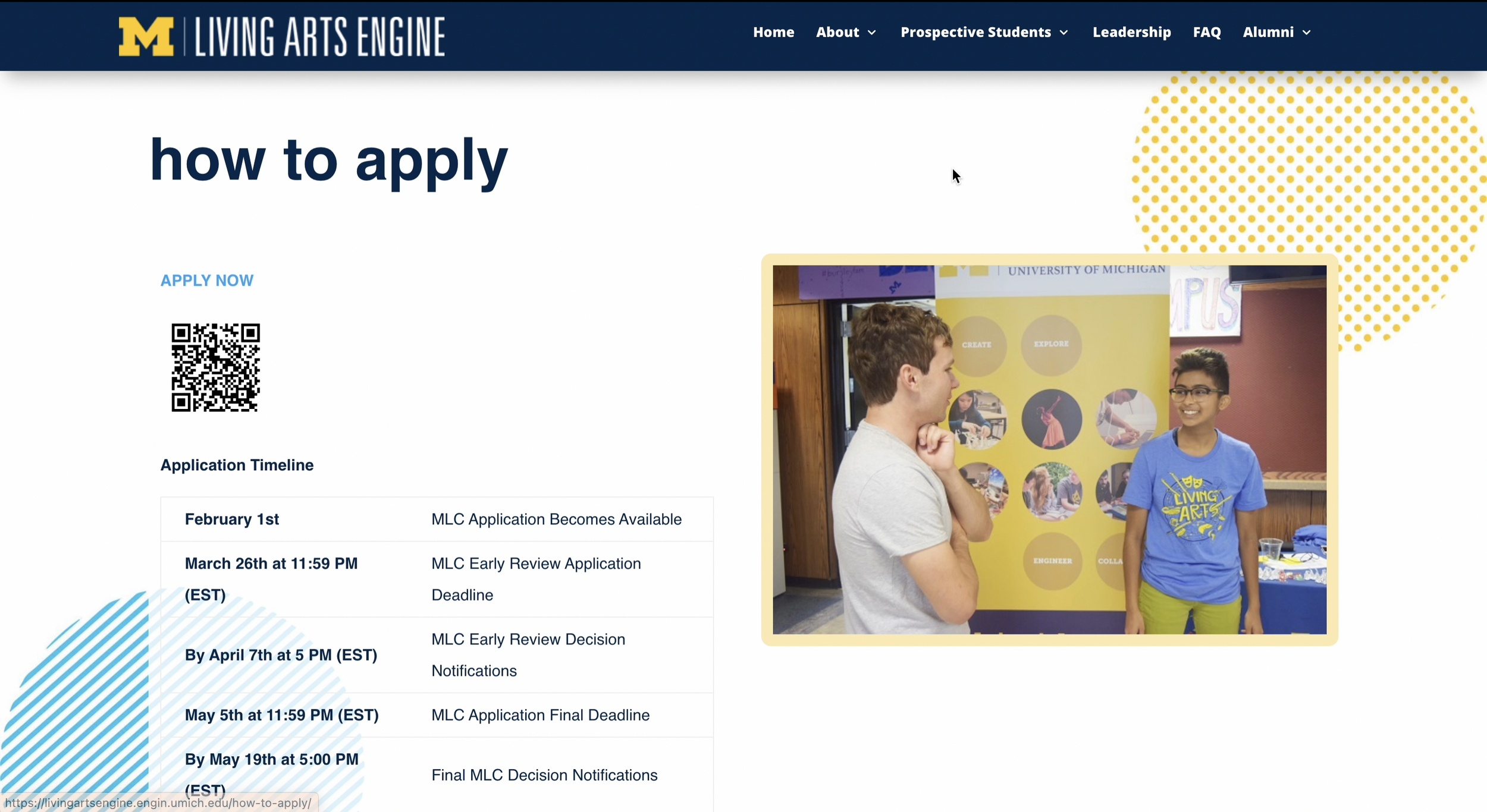
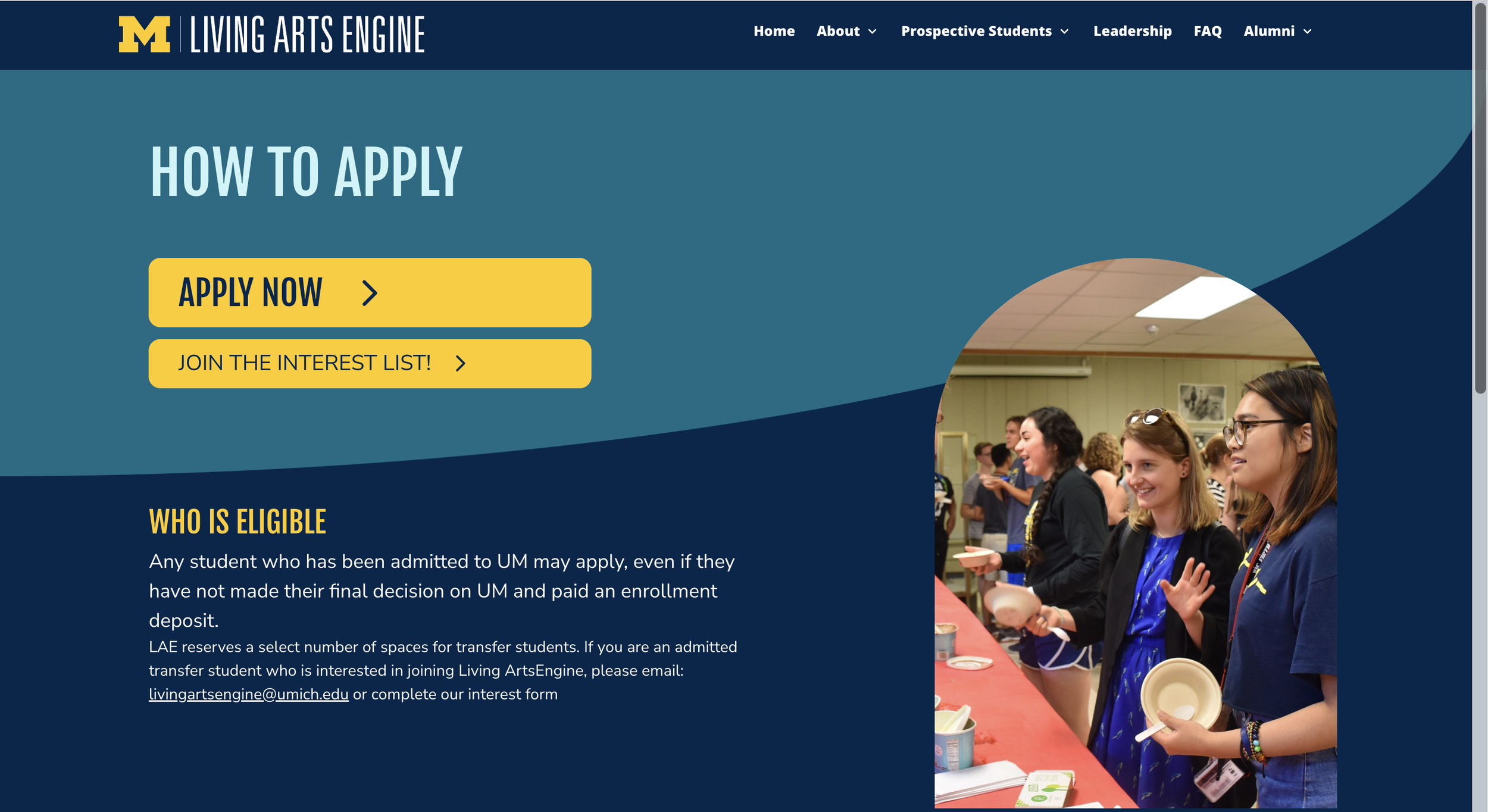
Check out the websiteA new window will be opened
* constantly making edits and suggestions *